Hey Person!
Here are the nine stages of rage / action / acceptance when it comes to dealing with someone ripping off your work:
1. Fury
2. Angry Tweeting
3. Regrets over angry tweeting and people calling you a troll
4. Writing the person directly in a way that is gentle, respectful, and educational
5. Receiving a defensive angry email back
6. Having your rep send an official stern letter
7a. They take the project down / send some form of apology (if it's an individual)
7b. They force you to file an official complaint with their legal team (if it's a company)
8. Feeling awful / exhausted no matter what happens
9. Pastries
(I recommend skipping the first three steps if you can)
The truth is, it’s pretty tough to get someone to acknowledge / offer compensation for a style ripoff. If you’re talking about someone working in your same medium or someone who was obviously the cheap version of you at the time of hire, chances are any pursuing / letter-writing you do will not lead to financial compensation. The best thing you can do is try to educate the person that ripped you off—they’re likely young and just don't know any better. If you do it in a way that is kind, you might end up making an ally instead of an enemy and they'll tread more carefully on future projects.
I used to get people sending me style rip-off-ers all the time, but they’ve definitely started to taper off. I think the style of lettering I helped to develop/revitalize just became so popular that people think of it as public domain now. I don’t mind, as the work is still coming in steadily and most of the people that are way too close to me stylistically acknowledge in some way that I was/am a big influence on their work. I try not to carry animosity toward the ones who don’t because that kind of stress makes you die young. The best medicine is to just keep working and know that any time and energy you spend getting panicky rage over people ripping you off takes away from your ability to make work. When you’re first starting out, you’re so defensive about your position in the industry because all the good stuff just started happening, but if you can keep the ball rolling and keep making awesome work, what once was a soul-crushing fury will turn into a barely noticeable annoyance that can at times legitimately feel flattering.
If you’re talking about someone ACTUALLY ripping off your work (i.e. reusing an image of yours without your permission or copying an image of yours exactly), there are of course ways to get compensation for the infringement but once you start threatening anything legal, especially with a bigger company, they will bury you in paperwork. Usually large companies have an in-house legal team that can devote endless hours to writing hard to read letters saying that what they have done is perfectly legal. Your lawyer must respond, and in no time the legal fees you're paying to keep up with the paperwork volleying start doubling / tripling / quintupling whatever the original fee might have been for the project had they hired you. I wouldn’t ignore a true rip-off, definitely send a letter to the artist (a much more stern one than you would to a style rip-off, but still give them the benefit of the doubt that they’re probably young and made a mistake and are not an awful human). Hopefully you'll get an apology back. The company, on the other hand, will be less likely to acknowledge / apologize without a fight.
There are brave souls that take on large companies when rip-offs happen (like Modern Dog) but if you followed their journey (which thankfully had a happy ending) it was full of heartache and stress, they had to sell their studio to pay legal fees, etc. If you’ve got the balls, the time, and the money to do it, and the company is CLEARLY doing something illegal by reusing / tracing your work, fight. Your battle will be tough, but you'll find plenty of support in the community for it.
The best advice I can give you is to copyright your images so that if a clear cut case of stealing comes across your plate, you have some ground to stand on legally. While you of course “own the copyright” to the images you create unless you're transferring them to the client in a contract, it’s difficult to pursue copyright infringement cases without having filed for copyright of the images officially.
Hopefully that helps!
J
Note: What follows is email correspondence between myself and a designer seeking advice. Names have been anonymousized, and I’ve subtracted praise since it would be icky of me to just post praisey emails.
Dear Ms. Hische,
My name is Person, I’m 21 and I’m going to be graduating from college in the spring with a degree in Graphic Design. I love doing lettering and illustration, especially chalk board signage and stuff like that, and I think that in the future I’ll be happiest doing freelance work on my own. But right now I have a job lined up for after I graduate at a giant company doing UX stuff (which I kind of hate) but this is the kind of deal where I can get a good salary and health insurance and stuff that I honestly could really use. I always figured I could just do freelance on the side until I can make it doing just that.
But one of my teachers just told us that the first few jobs we take after we graduate will dictate the work we do for the rest of our lives, because that will decide what our portfolios looks like. After class I went home and immediately burst into tears. I don’t want to be in a cubicle forever, I hate this job! I feel like I’m wasting valuable post-graduation time, but I need a roof over my head too.
Should I listen to my teacher and ditch this job and start hunting around for an internship at a studio that might not pay as well? Can I start making a name for myself doing freelance now? How did you go about making your promo to start freelancing? How can I take what I love and make it into a living like you did, what steps should I take?
I’m so sorry this is so long, but I really can’t thank you enough for reading through it.
Sincerely,
Person McPerson
Hey Person!
What your professor said is partially true, but it’s also a very very high pressure statement. It’s true that every job you have will affect your portfolio if you let it, but you could be a lion tamer during the day as long as you found time to do design at night. There’s no reason why you need to include the work from a crappy job in your portfolio if you’re finding time to make good work on your own. Professors say things like this because 90% of design students don’t have the motivation to go home after their day job and make a cool promo, or work on freelance work. They need their job to be what fuels their portfolio because they have a hard time doing it on their own.
What your professor said puts way too much pressure on you to get an amazing job straight out of school—which is REALLY REALLY hard! You’re young, take whatever job you think you will learn learn the most from and even if it’s not a “dream job”, there’s plenty to learn. Even cubicle jobs teach you a lot about how to deal with different kinds of personality types in office environments, how to write respectful emails, etc. Also, some people need to take higher paying less fun jobs when they’re young because of their life situation. Some people need amazing health insurance because of health issues, some people need a high salary because they’re supporting a parent or small child. The key is to take a job that doesn’t make you hate design and supports your development as a designer in one way or another, even if it’s just sugar-daddying your night time passion projects.
Internships are incredibly valuable and yes they pay very little. Tiny design studios pay lower salaries as well but you will learn a great deal by working at them. When I started out, I went the tiny studio route because I was fine living like a broke college student until my mid-twenties and because my day job also had 9-6 hours (instead of 9am-10pm hours that you often see at small creative agencies), which enabled me to freelance at night and eventually go on my own.
Do what feels right to you. If having a stable income takes a giant load off of your shoulders and allows you to be creative at night, keep that stable income job, but if it’s making you hate design and you come home exhausted and unable to work on your own stuff, quit it for sure.
As far as when to go freelance: I’d recommend having 3-6 months of rent / living costs in the bank before you do since it can take a while for the ball to really get rolling. I was working full time and freelancing “full time” (6-8 hours after work) for over a year before I quit my day job. I had enough saved that I didn’t suffocate under the pressure to make money in my first few months out.
Hopefully this helps!
J
Note: What follows is email correspondence between myself and a designer seeking advice. Names have been anonymousized, and I’ve subtracted praise since it would be icky of me to just post praisey emails.
Hi Jessica,
I recently graduated from a graphic and package design program (whoop!) and I’m really struggling with applying all that I’ve learned to “the real world.” I interned at a fairly large branding and design company for six months and found myself drowning. While everyone there said I kicked ass as an intern, I really didn’t feel like I was getting the direction that I needed; it was literally sink or swim. Not getting proper direction made me feel lost, and eventually I started questioning my abilities as a designer. Since I’ve left, I been trying to pick up the pieces to regain that go-get-’em confidence I once had.
This leads me to the reason I’m writing you. In the way you tell your story, it seems so divine; the way you seamlessly moved from one place to another and eventually found your way to doing it all on your own. Was there ever a time when you had overwhelming doubts about where you were going in your career, and questioned whether you were competent enough to pursue all you dreams? I know these are incredibly intimate questions, and feel free not to answer them, but being an over-sharer, I had hoped you wouldn’t mind. Any advice would be very much appreciated.
Thank you,
Person McPerson
Hey Person!
There are definitely times even now when I question the decisions I make about my career. Doubt and anxiety are totally normal and happen no matter how much success you have. You’re in a good place already if you can see what is missing from your life / your career, the only thing to do next is to come up with solutions of how to get that missing piece back in your life. If what you’re missing is direct interaction with a mentor or someone whose opinion you trust, there are a few ways around this. You could reach out to any designer in your area and see if you can buy them lunch in exchange for a portfolio review or see if they would be game for on-going critiques. I find that critiques from peers can also satisfy a good deal of this since so often the problem for me is really just showing the work to ANYONE before I send it to the client. It could even be a non-designer—having to explain my process to them, and having to talk about my work lets me see holes in the concepts and areas that can be improved upon.
Questioning your abilities is far better than blindly moving forward thinking you’re awesome and never stepping back to question the work that you’re doing. Just judge yourself against yourself, not against people you feel are leagues away from you. Have you improved over the last year? If not, what do you think held you back. If you have improved, what do you think helped most to move your work forward and what can you do to continue improving? It can be super intimidating if you’re always comparing yourself to other people, especially other people that for one reason or another have had more time to practice or more opportunities to learn under a mentor. I’m sure you learned a ton at the big branding place that you worked though maybe it was more about how you want to run a business in the future and what kind of job environment is best for you.
I have to step back constantly and look at the things that are good in my career and the things that I feel like I’m missing or can improve upon. Half of my side projects started because there was a skill I wanted to practice or something that I was excited to make but no one was hiring me to make it. Now at this point in my career, I’m torn between wanting to write and educate more since I love to help people like yourself find their way or feel less intimidated to start projects, but I get very depressed when I spend too much time talking about work and not enough time actually making it. I stretch myself too thin and feel like I don’t devote enough time to client projects. There is always something that you’ll be frustrated by or overwhelmed with in your career, just find a way to step back, look at what’s bothering you, and see what steps you can take to fix it, even if they’re small and gradual.
All the best,
J
Note: This text was created as a talk for An Event Apart in San Diego. It was presented Tuesday, May 21st 2013. Many thanks to Stephen Coles for his advising and light editing. While the full slide deck is not shown below, about a quarter of the original slides are used as editorial illustrations. To send comments or propose corrections (kind and helpful tone appreciated), email me.
Type Designers are your new best friends.
If you are a web designer, you are used to tedium. You are used to spending entirely too much time hovering over a keyboard googling endless combinations of words to figure out why something looks beautiful in Chrome but like a flaming pile of poo in Firefox. You write your own CSS and after the project is done you comb through it all to make it “prettier”. You can’t handle how some people format their PHP. You are a unique and wonderful kind of human—someone intensely focused on details that most people will never ever notice. You say to yourself “I don’t care that no one will ever appreciate this backbreaking work I’m doing except other intensely nerdy people like me. I care, the nerds care, and that’s enough for me.” If you are thinking to yourself “Wow! It’s uncanny how much this describes me!” You are awesome. You make the internet a better place. Take a deep breath and bask in your own awesomeness.
I want to introduce you to your brother from another mother—another group of humans that, like you, is quite under-appreciated: the type designer. Type designers and web designers have an amazing amount in common, that’s why it’s super wonderful that they’ve been collaborating more lately. Web designers are pumped that they can use more than a handful of fonts on the internet, and type designers are pumped that this new group of people using their fonts actually know how to use computers. You would be shocked at how many people try to download .zip files onto their iPhone to install fonts.
Web designers are familiar with “easter eggs”—the little things they build into the code for people in the know to see and delight in. Well, almost everything type designers make is an “easter egg” in one way or another, because most people think a typeface is just 52 letters, some numbers, and a few punctuation marks. Both groups of people, if they’re good at what they do, go above and beyond to make something amazing, even though most people have no idea what a “contextual alternate” is or would never notice that you’ve made two sets of images, one for retina and one for non-retina displays. Now that you, the web designer, are about ready to add “seeking type designer” to your OK Cupid profile, I’ll get into why it matters to know the people behind the fonts you’re using.
On Type Designers and Favorite T-Shirts
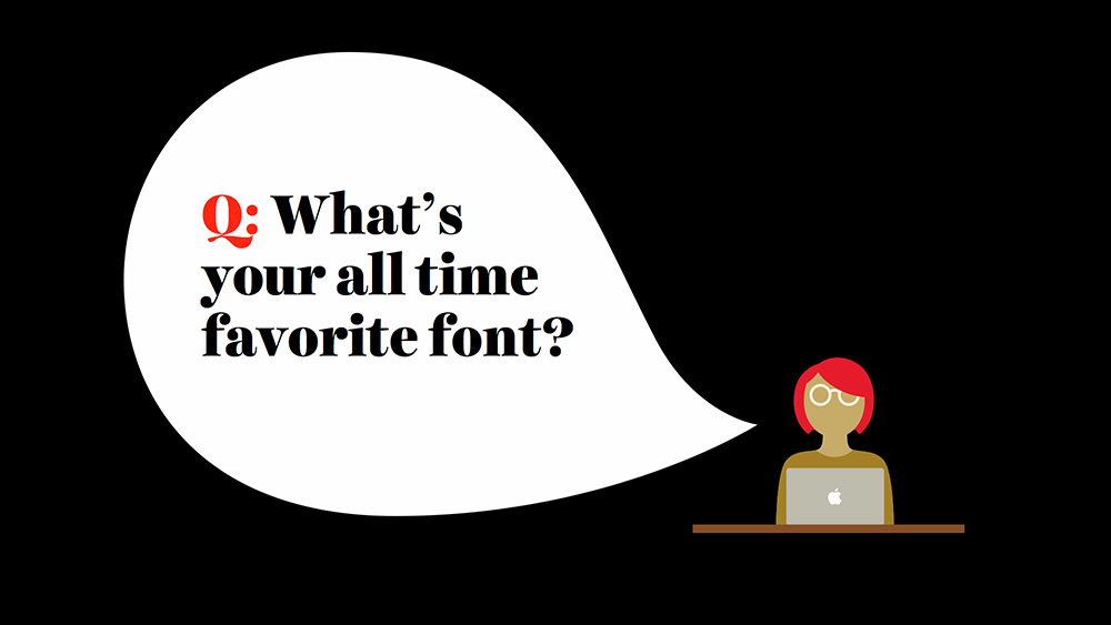
Before I introduce you to a few type designers, I’ll answer the question that every person in the type world is asked—“What’s your favorite font?” If you are a designer of any sort, you’ve probably been asked this question more than once. I know there are plenty of people that can easily name their favorite typeface (usually Helvetica) but I’m not one of them. I’m a believer that if you have a favorite font, you’re probably using it inappropriately or way too often.
Think of typefaces as items of clothing and your self-proclaimed favorite font as a hilarious ironic t-shirt. You love that t-shirt. You think you look like a goddamn model in that t-shirt because it fits like a glove and it’s the perfect amount of thread-bare. Maybe that t-shirt has even gotten you laid a few times. No matter how amazing you think that t-shirt is, if you wore it every single day and to every event, be it a happy hour or a black tie affair, people would start to notice. You’d probably get gentle remarks from your friends about how you should expand your wardrobe horizons from time to time. Strangers might think it’s the only t-shirt you own and that you’re some kind of mysteriously well-groomed homeless person. The other thing about your hilarious ironic t-shirt: it was cool like five years ago but now we all think it’s boring and dated. Don’t have a favorite font. Do have a favorite type designer.
Since I’m comparing fonts to t-shirts, I’ll compare type designers to fashion designers. While it’s ill-advised to wear the same item of clothing every day, it’s absolutely normal to have a favorite fashion designer (or several favorites). If you fall in love with a pair of pants one season, chances are that next season you can buy pants from the same designer and be similarly pleased.  Maybe you only buy shirts from one designer because they perfectly hide that Freshman 15 you’re still trying to rid yourself of at age 30. Maybe you only buy shoes from one designer because they are the only shoes you’ve ever owned that don’t give you a foot-sized blister. Either way, you know you can go back to those designers time and time again and find something you love and that works perfectly for you. If you get to know the type designers that make things that you love, you’ll never run out of beautiful typefaces to work with.
A few type designers I love:
-
H&FJ
Jonathan Hoefler & Tobias Frere-Jones
H&FJ have an incredible reputation for making beautiful text type. You probably know them best from their typefaces Gotham (embraced by the Obama campaign) and Archer (originally commissioned by Martha Stewart but now used everywhere.) I love these guys. And I use their fonts on my site.
-
If you’ve seen me speak in the last year, you’ve seen me use Jackson’s beautiful Harriet Series all over my presentations. The slides in this post use his typeface extensively. I love everything this man makes and when he showed me Harriet for the first time I wanted to both punch him in the face and kiss him on the lips.
-
Underware
Akiem Helmling, Bas Jacobs & Sami Kortemäki
You’re probably familiar with their typeface Bello but there are so many others worth checking out. I’m a big fan of Dolly, which is a very friendly serif, and Liza if only for the opentype insanity they programmed into it.
-
Josh and his studio make incredibly beautiful typefaces, including Freight, a serif super family and Omnes, a rounded sans that has a wonderful weight range and great personality.
-
I first became familiar with Mark’s work because of his typeface Coquette. His sans-serif display face Mostra Nuova is beautiful and vintagey and he has a slew of other great faces. Also, his website is lovely.
-
When I judged the TDC Type Annual a couple of years ago there was one typeface that made me say to myself “I can’t wait to go home and use that!” That typeface was Brandon Grotesque. Since then Hannes has released a few other faces including Pluto and Pluto Sans.
-
Type Together
Veronika Burian & José Scaglione
With typefaces like Abril and Bree under their belt, these guys can do no wrong. I think my favorite of theirs (right now) might be Maiola though. Goddamn I love that typeface.
-
I don’t know a single type-centric person that won’t praise the abilities of Kris Sowersby. He’s a young kiwi that’s released a string of hits including National and Founders Grotesque, and I love Galaxie Copernicus, which is a super pretty serif.
-
Lapture from JAF is a beautiful and weird text face and Herb is one of the coolest typefaces ever. These guys make beautiful type with the right amount of personality.
-
House Industries
Rich Roat, Andy Cruz, Ken Barber, & Others
You couldn’t spit without hitting one of House’s typefaces in my college design department. They specialize in fun and funky display typefaces that are beautiful and well built.
-
Commercial Type
Christian Schwartz & Paul Barnes
Christian and Paul have some truly beautiful typefaces and have carved out a niche in the newspaper industry for producing excellent newspaper type. Their talents don’t stop there though, check out Marian, a lovely hairline that, while impractical for the web, is still worth appreciating.
-
If you got married in the last five years, chances are high that you used one of Ale’s typefaces on your wedding invitation. If you love to play around with swashes, his fonts are for you.
-
MVB Fonts
Mark van Bronkhorst
Mark’s Sweet Sans is one of my favorite faces—I’ve always loved Engravers’ Gothic but found myself wishing it came in more weights or just had a bit more to it and then Sweet Sans debuted to answer my prayers.
Choosing the Right Type
There are some beautiful typefaces out there, but not all of them will be perfect for your project. If you’re a web designer, especially if you’ve attended past AEA Conferences, you have already heard a lot about putting the content first and making websites that don’t sacrifice legibility and ease of use for fluffy ornamentation. Figure out what kind of content is most prevalent in your project (more often than not plain ol’ body copy) and choose the typeface that satisfies the needs of that content. This first typeface you’ll choose is your anchor, a term I’m borrowing from Tim Brown’s little compendium of knowledge Combining Typefaces, which is an excellent and very quick read. All other typefaces you select must first pass the “does this jive with my anchor” test. Remember that just because a giant headline is the first thing your reader sees, that doesn’t mean it should be the first typeface you choose.
There are a bunch of things I take into consideration when choosing a text face that help me narrow down the candidates. Here’s a list of credentials a typeface must pass for me to want to use it as a text face:
-
Does it come in a variety of weights?
Being able to play with weights is incredibly important to me when I design. I’m not satisfied with the standard three weight set of light, regular, and bold. I like to work with typefaces that have inbetweener weights and if possible the full range from 100-900 just so that I have more flexibility while designing. Sometimes I want text to feel a little bolder or more emphasized but I don’t want it to be “bold”. Sometimes I want to set text at different sizes but maintain an even text color. Also, the more weights you have the more flexibility you have with color choices and reversing type out of image—you won’t have as many issues with how anti-aliasing affects the perception of type weight. I know that using a lot of fonts (each weight of a typeface is considered 1 font) can affect page load time—talk to your web font service about how you can streamline your site so that using multiple fonts doesn’t slow things down.
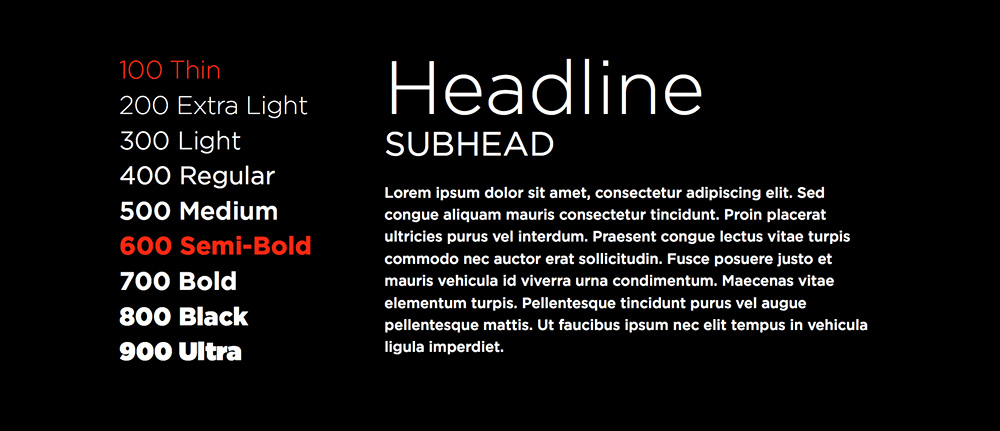
Gotham comes in eight weights (I own it in seven, hence the two red weights that either aren’t available or aren’t in my library), here’s how desktop definitions of weight might compare to web-friendly numbered weights.
-
Does it have a nice x-height?
A generous x-height (the height of lowercase characters) is very important when choosing a text face. If the x-height is too low, the typeface will appear smaller overall and the caps will have too much emphasis which interrupts smooth reading. If the x-height is way too high, your eye won’t be able to distinguish quickly between caps and lowercase, which can make you lose your place while reading. A generous x-height allows you to set type at small sizes (for captions and the like) and have it still be very legible.
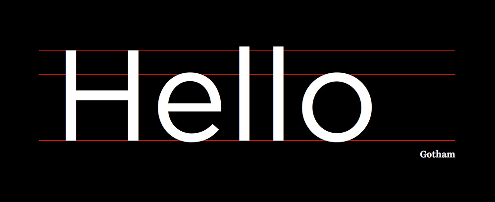
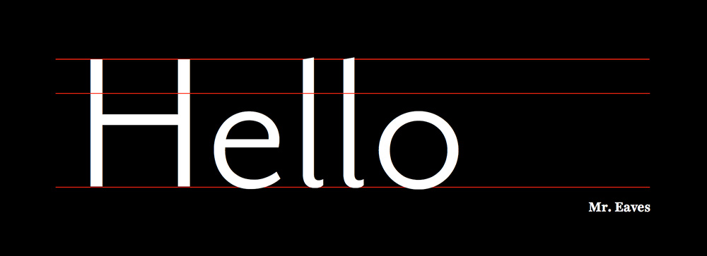
The x-height line shows just how much taller Gotham’s x-height is compared to Mr. Eaves.
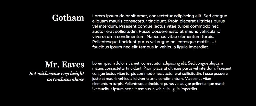
Mr Eaves looks smaller in comparison even though their cap heights are the same.
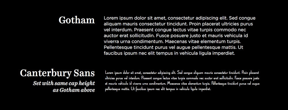
Canterbury Sans could never be used as text type. Its very low x-height makes it a poor candidate for body copy.
-
Does it have a true italic?
There’s a difference between a sloped roman and an italic, and that difference means the world to me. I love typefaces that have really lovely true italics that are easily identifiable in blocks of text. What makes an italic an italic is that its structure is more closely related to scripts or writing than a roman—it has identifiable entrance and exit strokes rather than perfectly symmetrical serifs and usually has a single story a and g. True italics also ensure even color (matching weight) within text when used with their roman counterpart. I love italics. Italics will be my gateway drug to text type design when I make the leap from lettering. Georgia’s italic is one of the reasons that typeface will always win for me over other standard serif text faces.
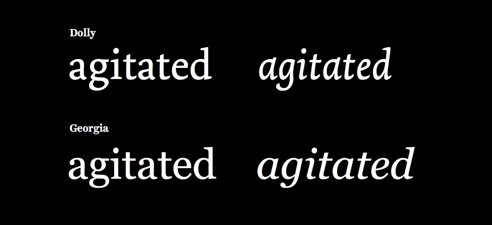
The letterforms for serif italics can be quite different from the roman letterforms. In sans-serifs, the difference is often less extreme.
-
Is it a typeface I’d want to hang out with?
Typefaces definitely have personalities and I’ll get into ways to conceptually brainstorm about type shortly. When it comes to text type, I usually want something even-tempered and laid back but not lacking in personality. Finding typefaces with the right personality balance can be incredibly difficult because if you add even the most minor bits of flair to a letter—even the slightest curvature to a serif—it can make the type feel like it’s sporting a screaming purple mohawk when set in paragraph form. Sometimes you want your type to sport a screaming purple mohawk, but I can confidently say that those times don’t happen often. I should also note that “screaming purple mohawk” is relative. What I consider to be a screaming purple mohawk, you would probably consider the most subtle nearly invisible change in tone. You are the husband that won’t notice I got a haircut unless I chop it all off and blondify myself.
Some other things I consider while choosing a text face:
-
Is it spaced well?
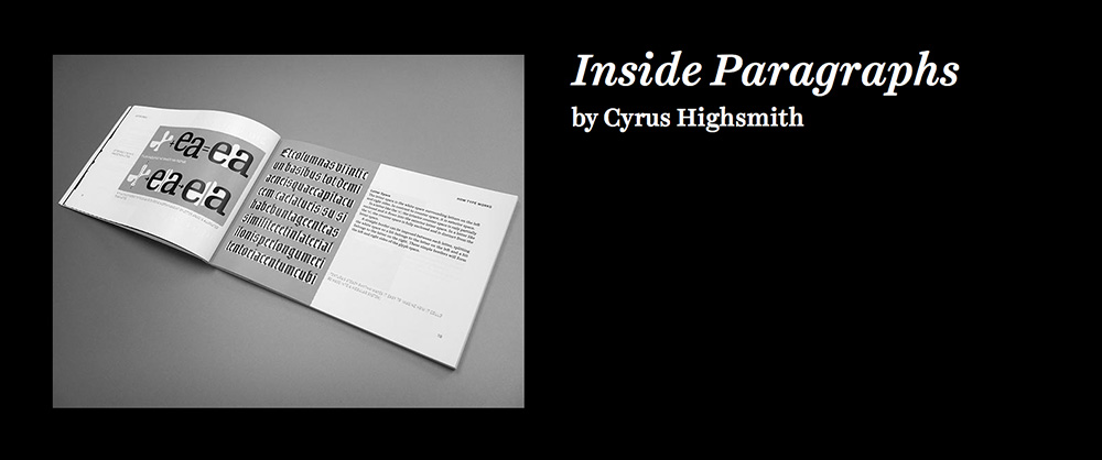
Text type requires looser spacing. Display requires tighter spacing. One reason Helvetica (the version you all have on your computers) doesn’t work well for text is that its letter-spacing is just too damn tight. If you feel like you have to add letter-spacing to 16px body copy, you might be working with a typeface that is too tightly spaced, or too tightly spaced for your taste. The white space within and surrounding a letter is incredibly important to the overall design of the type, just as important as the black parts—spacing can absolutely make or break a typeface. Cyrus Highsmith has a great section about establishing good spacing within and around type in his book Inside Paragraphs, which is a very quick read and a great intro to typographic principles.
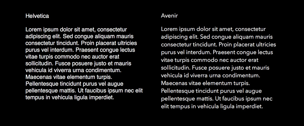
Avenir’s more open spacing make it a better text face than Helvetica.
-
Does it have even color?
Sometimes when you stare at a block of text some letters pop out to you more than others because the letter looks heavy where separate components (like a stem and a leg) join together. This can make type feel spotty and any good type designer will prevent this from happening by making little micro adjustments to the letters to make sure that they don’t feel optically heavier at the joins. Most of these changes are imperceivable by the average viewer—and they should be—but they make a world of difference to the type.
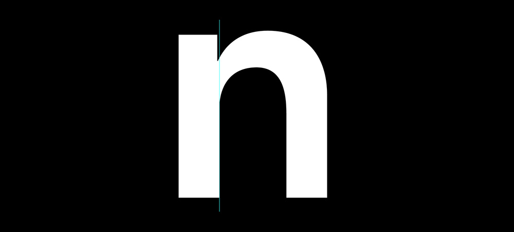
Notice how the stem on the n is less wide at the top to compensate for the weight at the join.
Consistent type color also has a lot to do with the counters, or the spaces within the letters. If counters are too closed, it can make a letter seem heavy or affect legibility and letter recognition. There’s some saying about how beginners design with black-space in mind and experts design with white-space in mind, but I forget the exact wording. You get the point.
-
What width or widths do I need?
Some typefaces come in a variety of widths (Narrow, Condensed, Regular, Extended, etc.), but when I talk about type width I’m not only talking about these drastic style changes within a family—I’m also talking about the difference in letter width between different “regular” width typefaces. You probably have a natural preference for certain type widths (I tend to like wider / more round feeling widths than narrow ones) but there are appropriate times to use type of all widths. If you’re designing a website with narrow text columns, you might want to pick a typeface whose regular width is a little on the narrow side so you can get more words on each line without having to scale text down, which helps keep hyphenation reasonable and type more legible. If you have a site that has columns with vastly different widths, finding a typeface that comes in a variety of widths can be incredibly helpful so you can use narrower width type on narrower columns and normal width to ever so slightly wide type on wider columns. The goal when setting type is to make it beautiful and readable, and one of the things that helps with legibility is per-line word-count. Choose typefaces that lend a hand in getting the right amount of words on a line.
-
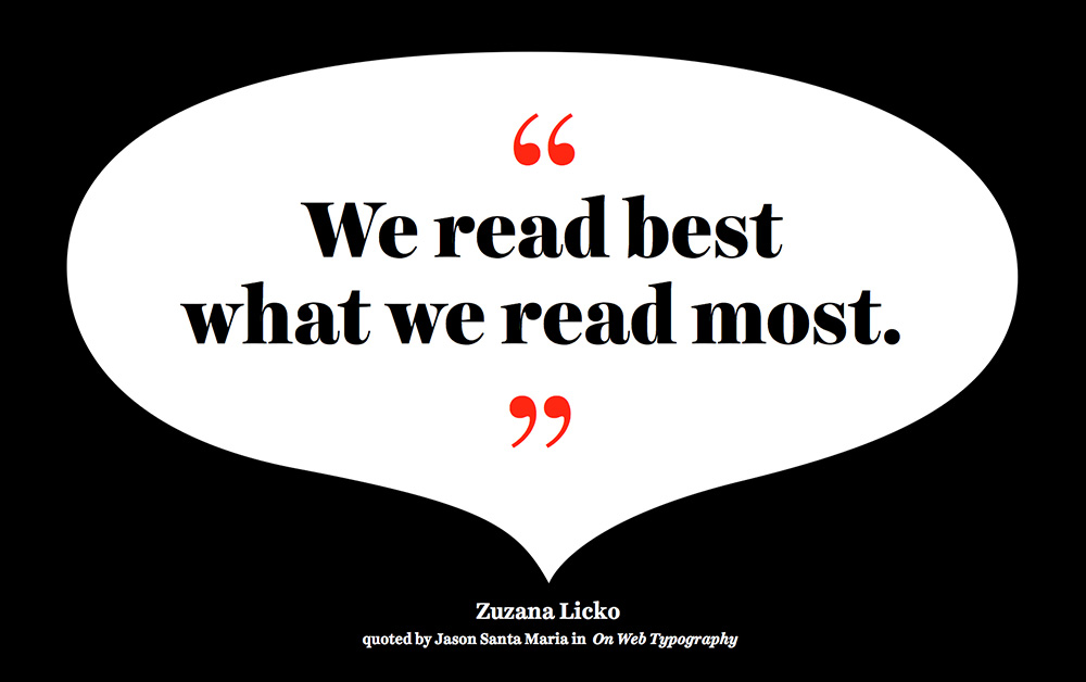
If it’s a sans, is there enough letter variety?
Using sans-serif typefaces for body copy can be a little tricky because without serifs it can be more difficult for the eye to quickly distinguish between two similar letter forms. I’ve used the term “legibility” more than once already, and while I won’t go off on a tangent on what makes a typeface more or less legible, I can say that it’s all about pattern recognition. In his 2009 article “On Web Typography” for A List Apart (which was expanded upon for an upcoming book), Jason Santa Maria quotes Zuzana Licko who stated “We read best what we read most.” Perhaps 50 years from now, Helvetica will be considered the most legible typeface on earth because of the insane Helvetica fetishism we’ve witnessed over the last few years, but for now our (western) eyes and brains are trained to skim quickly and effortlessly over serif typefaces and recognize patterns and shapes within the letters.
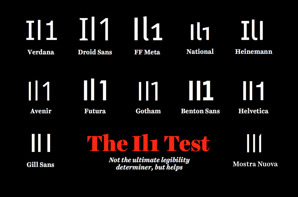
I try to find sans-serifs that pass the Il1 rule. Type a capital I a lowercase l and a number 1 next to each other. If you can’t tell the difference between these characters, you may run into some trouble when setting the text. There was a fake London2012 twitter account posting some incendiary things this year that looked completely legit because the sans-serif twitter uses (Helvetica Neue) doesn’t pass the Il1 rule. The account was actually London20l2 but no one could tell the difference. Also check to see if the typeface has a two-story a and g. Sans-serif typefaces with two-story a’s and g’s usually read a bit quicker than those with single-story a’s and g’s. All this said, 90% of the time I choose serif typefaces for body copy.
Where do I find good type?
You guys are in luck. Since I don’t work for one of the main web font providers unlike almost all people that write about web fonts nowadays, I can give you a bit of a different perspective about web font services. There are a variety of options out there and each has its own pros and cons. First, it’s probably good to understand the difference between hosted and self-hosted fonts.
Hosted vs. Self-Hosted Web Fonts
Hosted web fonts are definitely the easiest to implement and usually just involve adding a line of JS to your site in the head in order to install. You then just have to follow the provided instructions for calling the fonts in your CSS and you’re ready to roll. I prefer hosted web fonts because they’re incredibly painless to set up.
Self-hosted typefaces put more control in the designer’s hands but are a little less effortless to install. If you are a control freak, self-hosted fonts may be for you. One of the major disadvantages with self-hosted web fonts is that if the type designer chooses to update the typeface, you must manually update the typeface on your site (upload new files to your host) vs. a hosted service which will update the files automatically (sometimes prompting you to “republish your kit”). One of the major advantages of self-hosted web fonts is that if the type designer updates the typeface you must manually update the typeface on your site, leaving it up to you to decide if you want to update. You see what I did there?
Some Common Web Fonts Services
-
You guys are probably all pretty familiar with Typekit since they sponsor a lot of web related events and have one of the bigger presences in the web font world. Typekit uses a library subscription model for typefaces, which is absolutely wonderful for web designers. For a low monthly fee you get access to a large library of typefaces and can create endless “kits” for all of the websites you work on. The team of people behind Typekit goes above and beyond to make browsing for fonts easy and fun and they post very handy articles on their blog. Sometimes I feel like I should be sending Typekit extra money because they’re so inexpensive it feels like I’m stealing from them. That said, anything that is cheap for you the user is probably also not returning a ton of dough to the type designers. While I love Typekit, and use them all the time, there are definitely web font services that have a payment structure that leans more in the favor of the type designer than the consumer.
-
Webtype is run by some true type nerds over at Font Bureau. While they don’t have the biggest library, they do only serve up quality typefaces and specialize in the texty end of the spectrum. If you value quality over quantity this is the service for you. They do endless testing and tweaks to make sure everything looks amazing on both Mac and Windows. Type is rendered differently on Windows than it is on Mac, so sometimes something that looks beautiful and smooth on Mac looks completely weird and janky on Windows. Webtype goes to great lengths to make sure this doesn’t happen and that their type looks great even in the harshest environments. One of the main advantages of using Webtype over other font services is that they are actually designing / commissioning typefaces to be made specifically for web, rather than adapting print typefaces to a web environment.
Webtype is not a library subscription model, you pay individually and annually for each font you use on a site (pricing based on page views), but the fees are still quite low for what you get. This is definitely a pricing structure that is more in favor of type designers, but they do what they can to make it painless and inexpensive for the average user. Like most services with this pricing model, they do allow a free one month trial for their fonts so you can see everything in place before committing. You can also buy a perpetual license for typefaces, but most people opt to license for limited time periods if they foresee a redesign a few years down the road or want to save a little dough.
-
Fontdeck is similar to Webtype in its pricing structure—you pay per font per month based on average page views and there’s a free trial period to test typefaces before you commit. They have a wide selection of type and seem to focus more on quality over quantity, carrying a lot of the classics but also a good mix of new solid typefaces. Like Typekit, Fontdeck was founded by a group of enthusiastic web nerds with a passion for typography and also like Typekit, they’re very easy to use / install and offer both a JS (recommended) and an HTML option for font installation.
-
Fonts.com has an enormous library of fonts and has a pretty compelling marketing page. They stress how forward-thinking they are in terms of open-type support, that they have the best font selection with over 20,000 typefaces, and that they have unparalleled language support. It looks like at one point they priced their typefaces individually but are now offering a subscription model and their top tier subscription includes access to unlimited desktop fonts (a library of over 7,000 typefaces) delivered through a proprietary system called SkyFonts.
-
I haven’t personally used WebINK (yet!) but Thomas Phinney had some great things to say about it and he listed some features that many of you will find appealing: it does not require JavaScript for fonts to work (though you can still use JavaScript to suppress the dreaded Flash of Unstyled Text or “FOUT”); [he states that there is a] higher quality bar than Typekit or Google Web Fonts; there are over 1000 families, 5,000 fonts; 80% of WebINK fonts are enabled for Photoshop for purposes of comps and mockups via a plugin—once activated in Photoshop they work just like other fonts, no weird or awkward limitations. (Also enables Google Fonts in Photoshop.); the FontDropper bookmarklet allows users to try any WebINK fonts on any web page, live—including ones you are working on.
-
MyFonts is like a mega department store for type and like any mega department store not everything they sell is amazing. There’s some beautiful high end stuff on there but also some dreck. Also, they’re completely fine offering web font licenses to any typeface (with the designer’s permission of course) even if the typeface was not originally intended for web font use. Some fonts are offered as a perpetual license (which means you pay more up front but aren’t charged annually) and some are offered in a semi-subscriptiony way where you pay for page-views and have to re-up once you hit your limit. I know from personal experience that their self-hosted method is not the easiest to implement.
-
I’ve said some disparaging things about Google Fonts in the past, mostly because I think type designers already have a hard enough time getting paid so their “everything is free forever” model bothers me. Don’t start with the whole “the internet should be a place for a free exchange of ideas” line, and I know plenty of you guys think we should open-source everything ever, but type design is one of those professions that really does take a lifetime of experience to master and every typeface takes endless hours and sometimes years to create. The typefaces available through Google Fonts were made by type designers that were paid a one time flat fee for their work along with the promise of exposure to a large audience (and we all know how I feel about that incentive). Because of this fee structure, the fonts that are good often only come in one weight or aren’t available with an italic. All this said, it’s definitely one of the easiest services to implement on your site since there’s no need for a membership, login, or payment. I shake my fist at them for making something so easy to use that I have to dislike on principle.
-
Other Services and Options
It’s not my intention to make a comprehensive list of all web fonts services out there, and there are plenty of others including those set up by individual foundries. On my website, I use H&FJ web fonts, which are not yet available to the general public but will be soon. I definitely advise that if you fall in love with a typeface and notice that it’s not available through any of the major web fonts retailers, contact the designer to see if there’s a way for you to use their font. Also, if you notice a typeface is available through multiple retailers, you could do the type designer a serious solid by contacting them to see which of the services offers them the best cut of your cash. Above all, remember that working with type retailers and designers that focus on quality over quantity is key. The more browser/platform testing and insane perfectionist nonsense foundries do before they release a font, the better. You get what you pay for, and sometimes you end up “paying for” free fonts in different ways. Testing type in different conditions will always be necessary, but if you choose high quality fonts less of the testing will fall on your shoulders.
Thinking Conceptually
Defining the Mood
Alrighty, now that you know where to look and have established some general guidelines for what you are and aren’t looking for in an anchor typeface, you can start getting a little arty. Brainstorming for type is not dissimilar to brainstorming for an editorial illustration or a book cover. If you’re commissioned to create a book cover, first you have to read the book. 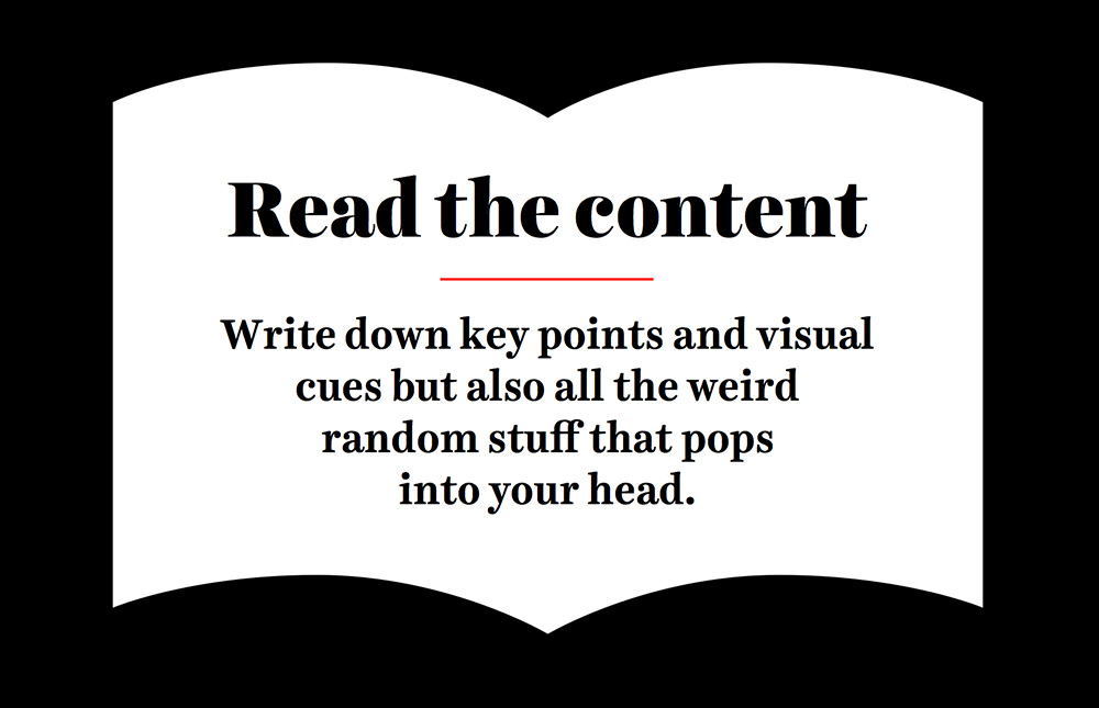 As you read, you write down key points and visual cues you might be able to pull from in the future—not just plot points and character names that could easily be found on Wikipedia, but also notes about how the text makes you feel. What are the characters like? What mood does each scene convey? You can even write down random words that pop into your head that seem completely unrelated to the book. Some deep crevice of your brain thinks those words may be relevant, and since you’re only brainstorming why hold yourself back?
I’m a huge fan of word association lists. I don’t make pretty “mind maps” where I try to draw visual connections between my thoughts, I just let my mind wander and write down any word that pops into my brain when reminiscing about a book I just finished or when brainstorming for a company’s logo. The less pretty and organized this list is, the more likely I am to actually let my mind wander. After I’ve exhausted every possible banal and bizarre thought point, I think about which of these words would be an a-ha moment for a savvy reader, sometimes voltroning a few words together to create a very unique and unexpected concept.
Sometimes pop culture attaches associations to type that are hard to shake. Most people think about Cooper Black as embodying the 1970s aesthetic despite the fact that it was created in the 1920s. Blackletter, before it was embraced by every Hot Topic-shopping high schooler, was just a fancy laborious way people wrote in the 12th century. Type without immediate cultural associations can definitely evoke a feeling and a backstory, you just have to spend enough time with it to let that story materialize. Most people aren’t used to thinking about type conceptually, and it’s absolutely more difficult to design with abstract forms rather than narrative images. Just because it’s easy to find shitty stock photos of ethnically ambiguous business men shaking hands on top of a globe doesn’t mean our conceptual thinking should stop there.
Establishing Historical Context
Sometimes you’re working on a project and you can add another layer of conceptual fun by sticking to type that was created during or accurately references the historical period your project is meant to convey. If you were making a porn website that specialized in films created between 1980 and 1985, wouldn’t it be fun to choose a text face that was created during that time frame? It wouldn’t need to be some crazy shoulder-padded display face, just a subtle wink to the era. I worked on a project with Google recently, and while I had to use some Google Web Fonts which were modern interpretations of type that could have existed in the 1920s, I did convince them to license Cheltenham as the main typeface. Cheltenham had the right amount of personality for the project and was made in the very early 20th century so it was totally feasible that it could have been used in the films.
Trying to be historically accurate is one of those things that will go unnoticed by most folks, but as we established earlier you don’t care that most people won’t know the extent of your labor—you’re happy that there are a few true nerds out there that will be tickled pink by your efforts. I should also probably mention that if you do make a very wrong decision when it comes to type, non-nerds will notice, they just won’t know how to verbalize what’s wrong. I like to compare making a typographic mistake (like accidental inverted stress on a letter, which is when the thickness is in the wrong place) to having an eye a half-inch higher than the other on your face. People might not be able to place right away what it is, but something about your face isn’t quite right.
When I worked on the typeface for Moonrise Kingdom, trying to find a script that felt true to the time was a little tough—most of the script typefaces that came out in the late 50s and early 60s (the story takes place on a small island in New England in the early 60s) were brush scripts, which didn’t feel right for the film. We had to reach a little earlier, into the 40s, to find something that made sense. Typefaces from the 40s would totally have still been in use in the 60s, especially in a small conservative town in the northeast. This sort of conceptual reasoning in typeface selection is something that clients love to hear about and can help you convince them to think beyond the standard “web safe” typefaces. The more you know about the typefaces you’re using, the easier it is to justify their use.
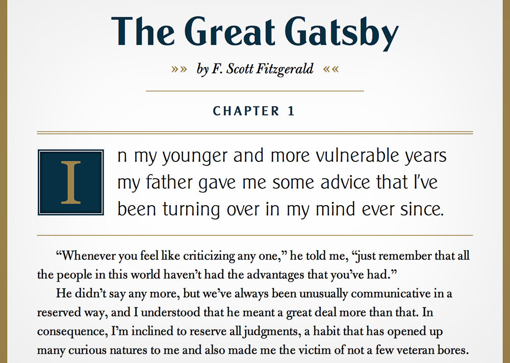
I created a little type sample—typesetting the title and the first few paragraphs of The Great Gatsby—to show you how historical accuracy can add an extra layer of oomph to your design. There are four versions, a completely un-styled version, a fully styled version that uses the default typeface Georgia, a version using typefaces that people perceive as being accurate to the time but are a little off, and a version using historically accurate typefaces. I also targeted the text differently in each version so you can see different ways to apply CSS to text. While the “somewhat accurate” version might scream 1920s a bit more loudly than the historically accurate version, there’s something nice about making historical references that are more subtle and less cartoonish. The reason why everyone throws up rainbows about the set design and costumes on Mad Men is because they go above and beyond to show more than just the most iconic designs of the 50s and 60s. Also, by using typefaces that are accurate to the time we don’t run the risk of rewriting history and adjusting the public perception of what design from that era looked like.
Pairing Typefaces
You can absolutely design an entire website with just one font family, but why miss out on all the fun of font-pairing? I’ll bring up the fashion design analogy again—if you dress head to toe in Paul Smith you’ll look sharp as a tack but you’ll also look like a walking advertisement for Paul Smith. Good fashionistas and good typographers flex their curatorial muscles by putting together items in unexpected combinations that lead to beautiful and harmonious (or purposefully discordant) results. (On a side note, I love making this fashion design analogy over and over again to a crowd whose wardrobe consists entirely of plaid button-downs and free t-shirts.) Establishing a relationship between two different typefaces can seem like a daunting task, but there are a lot of resources and writing out there to help you figure it out. One of my favorite sites to see good font pairing in action is Fonts in Use and if you want to hear some very smart people talk about pairing typefaces, look for talks and articles by Jason Santa Maria, Tim Brown, and Stephen Coles. Also, never hesitate to ask a type designer to recommend typefaces that will pair well with your anchor. Type designers, like most good nerds, love to share knowledge with anyone that’s hungry for it. Ask them about font pairing, licensing questions, technical questions, relationship advice—anything really. Also, if you can establish a relationship with a foundry or designer, they’ll usually let you try stuff out for free or give you access to early releases of upcoming typefaces.
Here are some tips for pairing typefaces:
-
Choose a Super-Family.
Some typefaces are released as a super family. Super families come with a variety of weights, a variety of widths, and sometimes a sans-serif and serif version meant to complement each other perfectly. Combining fonts from the same super family is definitely the first step to feeling confident mixing and matching typefaces. You can instantly create a harmonious relationship between two fonts this way, which is great if harmony is what you’re after.
Freight Display, Freight Text, and Freight Sans by Darden Studio.
-
Choose Typefaces from the same type designer.
Each designer has a personal aesthetic that shines through in their work, some more obviously than others. If you’re feeling timid about combining very different typefaces, do some foundry research first to find designers you like. If they have a number of typefaces available, chances are there are a few that would pair off well together.
-
Choose typefaces with similar characteristics.
Once you feel like you’re ready to take off the training wheels, try to make type pairings based on what they structurally have in common. To explain how you can establish similarities between two typefaces, I’ll first explain what you should be looking for. Typefaces can be thought about in three parts:
-
The Skeleton
The “bones” of the typeface or the basic frame on which the typeface is built. The skeleton determines the width of the letter, the x-height, and the general proportions of components of the letter.
-
The Meat
The body and weight of the typeface. While adjusting the weight of type can seem like the most dramatic change you can make, the type will still be relate closely to its underlying skeleton. Some typefaces are weighted in different ways than other depending on which tradition they emerged from—translation (broad nib) or expansion (pointed pen).
-
The Clothes
All the fun pizzazz we add to type to make it look awesome. Sometimes serifs can be classified as clothes or meat, depending on how essential they are to the structure of the type. Other things that would be considered clothes are spurs, ornamental serifs, drop shades, drop lines, etc.
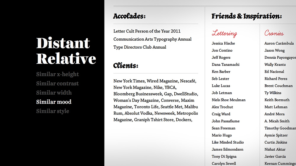
A serif and sans-serif might look spectacular together if they share a similar skeleton—a lot of people recommend this as a place to start. Find a serif for your body copy and a sans for your headlines. Sans and serifs can form an easy harmonious relationship if they have similar proportions (x-height, letter width, bowl shape and structure) and attitudes. I made a little chart of a way to think about the stages of relation between typefaces:
-
Sibling
- Similar x-height
- Similar contrast
- Similar width
- Similar mood
- Similar style
-
Cousin
- Similar x-height
- Similar contrast
- Similar width
- Similar mood
- Similar style
-
Distant Relative
- Similar x-height
- Similar contrast
- Similar width
- Similar mood
- Similar style
A sibling relationship example would be a sans-serif and serif from the same super family or a sans-serif and serif that have a very similar skeletal structure. When pairing typefaces that have a lot in common, ask yourself if the second typeface you have chosen is different enough to justify its use. Could you just get by with one typeface? Is this second typeface bringing something new to the table?
For a cousin relationship, two typefaces would have a lot in common structurally but exhibit differences that make them feel only tangentially related. Typefaces from the same type designer that are very different stylistically or typefaces created in the same era that share subtle similarities might be considered cousins. Some of the words you wrote down during your brainstorming session may come in handy now to help you figure out what your typefaces have in common.
To pair distant relatives together you have to get a little loose. Sometimes the only thing that unites a pair of typefaces is their mood or the feeling that you get when you see them. Some typefaces are like married couples that on paper seem like a terrible match but when you see them together it all makes sense.
Herb, Learning Curve, and Chaparral Pro on Erik Marinovich’s about page.
-
Don’t be afraid to experiment!
Web designers can easily test and play with many typefaces before committing to them thanks to free trials offered by foundries and web fonts services as well as tools like Typecast, which allows you to design with live fonts in the browser. Typecast is owned and operated by Monotype but includes typefaces by other foundries as well. Anyway, go forth! Have fun! Make the web a prettier and typeier place!
I know many of you went to art school and I’m assuming most of the people reading this article are designers, illustrators or others working within the world of what we reluctantly call “communication art”. When we graduated from art school, a career was promised to us. We wouldn’t spend our days covered in grape jelly, masturbating before crowds to win a spot at the Whitney Biennial—we would live normal lives, work at offices, bask in the glow of our computers. We would have stability and wouldn’t have to worry about how our “art” would pay the bills. Our parents were happy, we were happy, our fine-art friends called us sell-outs and all was right in the world.
We found our first job. After a couple years we wanted a change of pace and found a new one. Things were good. Life was easy. Mornings were spent perusing cute overload before the coffee kicked in. We designed without ever having to really deal with clients, invoicing, negotiating—all the icky businessy stuff that bums everyone out. Our left-brain atrophied.
Then one day we woke up with the itch. It became more and more powerful as we dragged ourselves to work on blizzardy days or suffered through hangovers under fluorescent lights and drop ceilings. At 7am, half awake under the weak arc of water emptying from our shower head we said to ourselves “I’m going to do it! I’m going to go freelance!” We threw on a towel and the world felt sparkly and new. We’d make our own hours! We’d sleep until noon if we wanted to! We’d no longer worry about using up all of our sick days. We’d be in control! (The freelancers reading this are without a doubt rolling their eyes at the naiveté we all once possessed). We gave notice at work and a few weeks later our dream was a reality. As time went on though, we realized this reality was not always a dream come true.
Now we were more than creatives, we were business people. If we were one of the lucky ones, we picked up enough client work to keep us from retreating, tail between our legs, to our previous lives as employees. We completely fucked ourselves over on those first few jobs but eventually cobbled together a relatively good standard contract and learned to say enough is enough after the 10th round of revisions. This is not the stuff we learned in college. If you even thought about contracts and invoices before that art school diploma hit your hand I commend your professors, but most of us were off in la la land developing identities for fictitious products, complaining about how we only had seven weeks to get that logo right.
You can learn a lot of the business end of design and illustration by trial and error and reading articles and books, but one thing that is seemingly impossible to get a grasp on is pricing. Whether you are a student, a young designer, or a seasoned pro, pricing jobs can be one of the most frustrating parts of the creative process. The cost of creative work is shrouded in mystery and very subjective. While it makes some people uncomfortable to talk about art and money together (as we all know creatives are really meant to suffer through life and die penniless), they are incredibly similar when you think about it. What is money other than dirty rectangles of pressed tree pulp? Because we all believe it has value it is valuable.
I know you’re all dying for me to get down to brass tacks and explain how to price for each and every design situation, but what follows won’t be anywhere close to a definitive guide, just some of my own opinions and words of wisdom on how to avoid screwing yourself and the rest of us over by doing too much work for too little pay. We’re in charge of assigning value to what we do. Alright, here we go!
-
Pricing hourly punishes efficiency.
So this is a pretty bold statement and like any bold blanket statement it should be taken with a grain of salt. Hourly pricing can be incredibly advantageous in certain circumstances, like when you receive that first email from a potential client and, through their thousand word introductory essay lousy with emoticons and unnecessarily capitalized words, they paint a clear picture that they are completely batshit insane. You know that there will be many rounds of revision in your future and that over the course of working together you’ll be as much a therapist as a designer. Totaling those 500 hours at whatever your hourly rate is will equal a pretty good pay day.
It’s more than just crazy people that can make hourly pricing worthwhile though—pricing any long term design project hourly can be advantageous, as long as you communicate clearly along the way what kind of hours you’re devoting to the project. If the first time your client sees your total hours is on the job-concluding invoice, a world of hurt awaits. It will be like being audited except somehow more unpleasant. Be prepared to forward them every approving email, to itemize every minute spent on the website / book / whatever.
Pricing hourly seems much easier than flat rate pricing, but because you have to give clients a ballpark full-cost price upfront (the total hours you plan to work x hourly rate), you can end up in a very tough spot if you don’t have a firm grasp on how long it takes you to do things. You’re nearing the halfway point in the project and are already over the total hours you’re contractually committed to. What does this mean? It almost never means that you’re paid double your original fee. Even if you can eek out a little extra money from the client, by the end of the project your hourly rate will look more like the one you were earning at the Blue Comet Diner at age 16.
So once you have a grip on your work flow and become more and more efficient, hourly pricing makes perfect sense, right? You know how long it will take you to do something, you price for it, everyone is happy. Unfortunately this is a half truth. Sure you’re getting paid well enough and certainly making more hourly than you probably were at your old day job, but I’ll paint a picture as to why this is a flawed pricing model: Two designers are hired to produce posters for a music festival. Both have the same hourly rate of $100 per hour (a reasonable rate for someone that’s been in the biz for a few years and has a few accolades under their belt), but one designer works much faster than the other. Both are equally talented, but one is far more efficient. At the end of the job, the designers turn in their invoices—he worked on it for a total of 18 hours and she a total of 7 hours. He is paid a respectable fee of $1800 and she $700 for producing the same result. Your rational mind says “Well, he did work more hours than her...” but part of you knows that this isn’t completely fair, and that part is correct. This becomes epically clear when working for big name clients.
Here’s another scenario: You’re hired to do a monogram for a giant international company. They’ll want to use this monogram on everything from price tags to billboards to TV spots and they want to use it forever (in perpetuity until the sun explodes). They have a pretty clear idea of what they want and you know that it will take about 10 hours total with the initial exploration, back and forth revisions, and finalizing. Even if your hourly rate is $250 / hour (a pretty high rate), the total you’re earning for that logo is $2,500. If you think that is a good price for a professional designer to earn crafting what is essentially a logo for a huge company, you are mistaken. So if you aren’t pricing hourly, how DO you price?
Licensing and Rights-Management
So while pricing hourly has its disadvantages, it’s a good place to start. Most designers take into account the hours they’ll put into a project when coming up with a price, but the seasoned professionals use it as part of the way they quote a project, and not as the only defining factor. Once you feel comfortable with your hourly rate and can somewhat accurately predict how long it will take you to do something, there are a few other things to consider that will boost your prices and turn this design hobby of yours into an actual sustainable career.
As a designer, when you hear the term “rights-management” it takes you back to your intern days doing photo research, trying to find non-awful royalty-free images after your boss told you all the rights-managed photos were way too expensive. How does rights-management apply to a designer or illustrator? Photographers aren’t the only ones able to manage the rights of their work. You inherently own the rights to anything you create, this is why it’s incredibly important to read every contract for every job. Often times clients want more rights than what they are willing to pay for—the biggest red flag word being “work for hire”. This means that the client owns all the rights to anything you create for them. They essentially, legally, become the author of your work.
As a graphic designer, work for hire is a bit more acceptable in many situations since you’re not authoring new content as much as creating a beautiful context for other people’s content (speaking specifically about any sort of layout design). Where rights management usually comes into play is in the context of identity work, and this is why logos are priced the way they are. It’s understood that the clients will need the rights to the mark you create so that they can trademark it and use it on unlimited applications, so when pricing for a logo you should take that into account. In addition to a fair hourly rate, clients pay for the rights to use that logo in an unlimited capacity.
Aside from giving away all the rights to your work for an additional (hopefully ginormous) fee, you can give them away for limited periods of time or for limited applications by licensing work to clients. There are fewer ways to do this as a graphic designer, but licensing is an incredibly (incredibly!) important part of being an illustrator or letterer. Of the couple hundred client projects I’ve done over the past few years, very few of them have required a full buyout of all rights, and the ones that have required them paid my rent for the better part of a year. Here are some factors that go into pricing a job based on licensing:
- How long does the client want to license the artwork for?One month? One year? Two years? Five years? In perpetuity?
- In what context is the artwork going to be used?Do they have the rights to use it on anything? In print only? Web only? Broadcast? Tattooed on their faces?
- If the job is reprinted, will there be an additional fee for a reprint?
- Do they want an unlimited license or do they need to own the rights?
- Are these rights transferrable if the company is sold?
- What kind of company is it?Is it for a Mom-and-Pop business, a multi-billion dollar corporation or something in between?
By now your head must be spinning. This is some complicated stuff right? Maybe, but this is how you can actually make a living doing illustration and design and maybe even eventually quit your but-they-give-me-health-insurance barista job. What follows is a fictional pricing example to show how powerful licensing can be. I’m going to write it in the context of lettering, which is priced essentially the same as illustration. Graphic designers should still pay attention though, because when I talk about buyout pricing, that’s essentially what you’re going to be thinking about when pricing logos. My price points will be higher than what a fresh faced n00b can probably charge, but should at least illustrate how much of an impact licensing can have on the cost of artwork.
-
The Correspondence
Dear Ms. Hische,
I’m an art director at Awesome Agency Inc, working on a campaign for an international clothing brand (on par with the gap) and am writing to gauge your interest in creating artwork for us. We need one five-word phrase illustrated in a script style. The artwork should be highly illustrative, attached are some examples of work you and others have done that are in the ballpark of what we want for the campaign. If this sounds appealing to you, please send us a quote by end of day tomorrow so that we can present your work, along with a few others we are gathering quotes from, to the client. Thanks so much and look forward to working with you!
Sincerely,
Arthur Director
They didn’t give me much to go on here aside from the actual work I’m creating. It sounds like a cool job, but I’m going to need to do some investigating before giving a proper quote. The biggest young designer mistake here would be to quote a flat fee without finding out what kind of usage rights they want.
Thanks so much for thinking of me Arthur! I’ll put together a quote this afternoon. Do you want me to price for every usage scenario or do you have some specific uses in mind?
All the best,
Jessica
Usually here they’d write back with some very very specific uses in mind which makes it a bit easier to quote, but sometimes you’ll get a letter that looks something like this:
Hi Jessica,
Great to hear back from you! We’re still in the exploratory stages of the project, so we can’t give specific usage situations yet. Please quote for creation of artwork for presentation only and for a few ballpark usages.
Arthur
-
What We Know
- This is for a big international clothing company.
- They are gathering prices from a few different people.They’ll present several artists to the client who will chose based on style or lowest price depending on what the client’s priority is.
- They want a price for presentation only.This means you create the artwork and they only have the right to show it around in-house and to the client, NOT to use it in any way for their campaign.
- They want a number of usage scenarios.This is on top of that initial creation / presentation fee.
-
Pricing for Presentation
If you’ve done any editorial illustration work (magazines and newspapers), you know that the rates are pretty standard across the board: $250-$500 for a spot illustration, $500-$750 for a half page, $1000-$1500 for a full page, $2000-$3000 for a full spread, $1500-$3500 for a cover. These are all pretty normal prices and there are of course magazines that pay higher or lower. I tend to start with these prices in mind when thinking about pricing for “Presentation Only”.
They want a five word phrase that is highly illustrative, which equates to “a full page illustration” or so. Because this is for advertising and not editorial, adjust your rates depending on the client. This is for a big company, so my presentation only fee might be somewhere around the $5000-$7000 mark depending on how complicated what they’re after actually is. If this was for a smaller company, the presentation only fee might be closer to $2500 or $3500.
-
Sample Usage Scenarios
If a client doesn’t tell you specifically what usage rights they need, you should make sure there is a good range represented. In this situation, I’m definitely going to price based on the length of time they need it, plus some general examples of what context the artwork will be used in. When you send your quote, it should be broken down as clearly as possible so there is no confusion as to what the clients are paying for in each stage of rights licensing. This would be the quote I would send back:
Hi Arthur,
Below are a few sample quotes for the project. As I did not have much info about what usage rights you needed, we would need to talk specifically about anything not mentioned below once the client has a clearer picture of what they need.
-
Presentation Only: $7000
2-3 initial pencil sketches shown, one chosen to be created as final art. After final artwork is presented, the client may request up to two rounds of minor revision. Additional revisions after this point will be billed at $250/hr. If the client chooses to not move forward after pencils are presented, a kill fee of $3500 will be paid for completion of sketches. If artwork is completed to final, the full fee will be paid.
-
Usage Scenario 1: +$5000
The client may use the artwork in magazine and newspaper ads (domestic and international) for a period of 1 year.
-
Usage Scenario 2: +$7500
The client may use the artwork in all print media (domestic and international) including but not limited to magazines, newspapers, point-of-purchase displays, posters, and billboards for a period of 1 year.
-
Usage Scenario 3: +$10,000
The client may use the artwork in all print and online media for a period of 1 year.
-
Usage Scenario 4: +$14,000
The client may use the artwork in all print media, all online media, and broadcast media for a period of 1 year.
-
Buyout: +$25,000
The client may use the artwork in all media including print, online, and broadcast in perpetuity.
Thanks so much for thinking of me for the project, let me know how these numbers go over and if you need any clarification about the different usage points.
All the best
J
So this is a pretty basic breakdown, but it gives the agency/client a lot of price points to consider. If I wanted to break it down even further, I would price based on 2 year and 5 year use and give different prices for U.S. only, North America only, etc. Most importantly, note that all of the usage scenarios are on top of our original presentation only / artwork creation price. The prices are not cumulative in this example quote, so each +$ is only added to the presentation fee. The top price in this scenario is $32,000 (I saw there was some confusion in comments so thought I’d clarify). These prices might seem completely outrageous to you, but they’re actually pretty reasonable when we take into effect who the client is and what kind of rights they’ll probably need. If you’re an up-and-comer, your prices might be a bit lower but the percentage markup should remain about the same. Imagine if we had priced this hourly!
-
How do you know if you priced right?
If the client writes back immediately and says “These numbers look great! We’ll send along a contract for you to go over in a few days!” It probably means your prices are too low. If they write back and try to negotiate you down a little bit, you were probably pretty spot on, and if they write back and say that this is well beyond their budget, you get to decide whether or not you want to figure out a way to work within their budget or whether you want to walk away and take one for the team. When you’re offered a very low budget by a very huge client, you can always feel good about turning it down knowing that you are helping to raise the standards of pricing for others.
-
Why doesn’t anyone ever talk about pricing?
There are a lot of reasons why designers and illustrators are reluctant to talk about pricing, the most obvious being that no one wants to shout their annual income to the masses. Once you start giving away your general prices, it’s not incredibly difficult to add things up and figure out a ballpark of what an individual or company makes in a year. A personal note: don’t assume that the pricing structure above means that I’m swimming in a pile of money. My half-retired dentist father still makes more than I do. The fake job I used as an example above is an advertising job, and I used it as an example because pricing for advertising is one of the darkest arts of all. There are wild differences in pricing from presentation to buyout, and a ton of factors that affect the price. It’s great to surround yourself with friends or more experienced designers that can help you price a job. You can always consult The GAG’s Ethical Guide for Pricing, but definitely use it for ballparking more than definitive numbers.
-
The Pricing Domino Effect
It’s incredibly important for even young designers to always quote respectable prices. It can be very tempting to create artwork for a “cool” company for very little pay and the promise of insane exposure / an incredible portfolio piece. Every successful designer and illustrator has at one point succumbed to the siren song of the “cool” industries (there are a few “cool” companies that don’t try to take advantage of designers but they are the exception and not the norm). When you are starting your career as a freelancer, it will be incredibly tempting to take on any work that comes along, no matter how unfairly companies are trying to compensate you. Remember that you are talented and that your talent has value and that ultimately it is up to you to determine how much people value your talent. By helping to keep pricing standards high, you not only help yourself by avoiding the title of “The Poor Man’s Marian Bantjes” (essentially the creative equivalent of a knock-off handbag), you also help every other young designer struggling to get paid out there, and help every designer that came before you to continue making a living doing what they love.
A footnote for the haters:
For whatever reason, whenever anyone writes an article like this—asking designers to raise the standards for themselves and others, calling out companies for unfair pay or empty promises—there are always a few anonymous contrarians that berate the author for preaching from an ivory tower, not understanding what the masses are actually going through. I have been lucky enough to have success in my career, and I want to use the knowledge I’ve gained to help others have success. Why anyone would complain when someone is advocating for better wages, I do not know, but it always happens.
As I’ve watched my flowchart get reposted around the internet a bit, there is a topic that is always brought up in comments that I didn’t address on the chart itself: internships. I purposefully avoided talking about them on the chart, just as I avoided diving into great detail about non-profit work—because both are pretty complex matters. When it comes to non-profit work, I know several designers that make their entire living working at or doing freelance for non-profits. On the chart, I wanted to get the point across that most non-profits are legitimate businesses and that while they aren’t declaring profit at the end of the year, they still have expected operating costs and your design work should not necessarily be left out of the mix. Anyway, I’m already off on a tangent, let’s get back to the issue at hand.
When I was in college, my university wouldn’t give you academic credit for an unpaid internship. Local design studios knew this, and knew that if they wanted an intern from Tyler School of Art, they would have to fork over some cash (albeit very little cash). It worked out great. Of the three internships I had in college, all were paid. That doesn’t mean I was raking it in, but I was able to change my humble diet of ramen to…pasta.
There is (and has always been) a giant trend to compensate interns in “experience” alone. It’s one thing for a 18-year-old that has never opened Photoshop to walk into a tiny design studio and expect little or no compensation, but the more I talk to young designers struggling to get work, the more I see people in their early and mid-twenties (most with bachelor and graduate degrees) having to settle for unpaid internships in their quest to find a real job. These are people with real skills and they are being taken advantage of. Everyone knows that you won’t get rich from an internship, but companies (even tiny ones) can afford to pay you something for your time, even if what you’re being paid amounts to little more than minimum wage in a city like New York. The big argument you’ll hear against paying interns is that you are learning a lot from the company or designer you’re working for and that their time is so valuable that they are working at a loss to educate you. This is complete bullshit. Well, maybe not complete bullshit but definitely a hearty serving of it.
If you’ve ever had an internship, you know that many of your duties revolve around doing things that other people really don’t want to do—from general office and gopher work like shredding papers, organizing, standing in line at the post office, and getting coffee, to the slightly more design-industry-related stock photo researching. In my opinion, this is the stuff you should definitely be getting paid for. I’m sure someone could argue that you learn something by hovering over a trash can for three hours to the discordant buzz of a shredder, but seriously. Pay that person. Reward them monetarily for being your tedium slave. However you verbally package the skill set they’re building while doing your chores, you are delusional if you think they enjoy it.
Where it gets a bit tricky is when interns are actually doing something of value for a company. Many of you readers will jump in here and say “Well you’re practically an employee! You should be paid as one!” This is true, especially if you are working enough hours that it becomes difficult to have a second pay-the-bills job, but it’s a bit more nuanced than that. You are doing things that are employee-like—converting Quark files to InDesign files, archiving, prepping files for the designer to send to print, maybe even doing some light design work that will most likely never be shown to the client. Should you be compensated for this? Yes, of course. Again, I think interns should be monetarily compensated no matter what. But as you know, money isn’t everything and the most important part of any internship or junior level job should be the experience and knowledge you take away.
I know you all picked up your pitchforks at the mere mention of the word “experience”. Like “exposure”, “experience” can be a very toxic word when used by the wrong person. We’ve all at one point had a job or freelance gig that offered this intangible payment in lieu of real money. Some of us lucked out and actually received a wonderful education, and some of us walked away with an in-depth knowledge of copy machine maintenance. The thing is, anyone heading into an internship absolutely wants experience. If you aren’t looking to learn something and improve your skills in every job you have over the course of your career, you have probably found yourself in the wrong industry. But before you agree to a low paying job, examine what you’ll actually be learning there. Sometimes that experience is very valuable, especially if your employer takes a lot of time to personally educate you—it’s almost like getting paid to go to grad school.
It can be very difficult to have this kind of one-on-one education at a larger company. If you’ve ever interned for a company with more than 50 employees, you know that generally you’re not getting the attention of a supervisor for more than an hour or two every week. That’s not to say there aren’t exceptions to this rule, but (for the most part) a supervisor willing to spend quality facetime with you—time spent actually educating you and critiquing your work—is as mythical a creature as the unicorn. Your job as the office intern is to help out and demand as little time as possible from your employer. The education you’re receiving has more to do with office politics than design. In exchange for this, for being the unseen helper cog in the company machine, you should be paid and paid fairly well.
Employers: before you get in a big huff, I’m not saying you need to pay interns in gold bricks. There is a giant chasm between what interns are usually paid and what qualifies as fair wages in a big city. Have a few less fancy coffees in a week and you can afford to pay an intern ten dollars an hour. Also, we can totally see through the full-time jobs disguised as “internships”. You’re not fooling anyone.
Future Interns: Should you ever take an unpaid internship? I’d advise against it unless under very specific circumstances (like job shadowing or a position in which you’re not actually doing useful work for an employer). The reason why there are so many unpaid internships is because so many people are willing to work for free. My university didn’t allow its students to take unpaid internships and by doing so forced local businesses to offer paid internships if they wanted to employ one of its students. Someone has to step in and say “this is the standard and what you are offering is below the standard” before anyone will stop and take notice. Should you take a lower paying internship that offers more hands-on training experience and one-on-one time with a supervisor? In my opinion, yes absolutely. While you should be compensated something for the work you do, your employer’s time is valuable, and if they are taking time to give you a proper education, the lower pay can be well worth it.
Note: This is a recently edited article I originally wrote in 2010. Since writing it, I’ve accumulated a heck of a lot of HTML and CSS skillz (I made this here website!), but I still do not offer my web design or front-end dev services to clients. There will be an article to follow specifically dealing with specialization, but there are definitely some points in this post I feel are worth sharing.
I might seem like a jack of all trades, but I’m really a specialist. I specialize in lettering, type design, and illustration—this is what I’m best at and is probably why you found my website in the first place. I find it strange that I get so many requests for web design—I went to school for graphic design, yes, but each sub-field of graphic design has its own set of problems, limitations, and guidelines.
Just as you wouldn’t expect any random person that owns Adobe illustrator to be able to draw a decorative letter from scratch, you can’t expect any print designer to be able to really and truly design for web. Web design is not print design, it’s a whole different and very complex animal. When a person encounters a book or brochure, they know how to use it. They look at the cover, they open the cover, and page by page they work their way to the end. Web design is, for the most part, not linear, and the way that people use and peruse the web changes constantly. To be a good web designer you must live and breathe the web. You have to pay attention to trends, read articles about best practices, essentially do whatever you can to stay relevant and current. If you don’t throw yourself head-first into the field, you end up making websites that feel “two years ago” or believing that Flash is still “The Next Big Thing”.
Not all web designers can code their own websites, but to be a good web designer you absolutely need to know what others are capable of doing. I believe all people that design for the web should be able to do basic front end coding (HTML and CSS), because so much of the design process can happen at that stage. I know a few web folks will get up in arms with me about this but it took me 6 months to learn most of what I needed to learn to edit Wordpress or other blog platforms and I am not trying to be a professional web designer. If you really want to know how I feel about it, check out this talk I gave. Also, unless your website is incredibly image heavy (like all of your navigation is image and much of your content is image) it just makes sense to do some designing in the browser as it is so much easier to make universal changes and move things around and see them (almost) exactly how others will. Not being able to do basic coding is like being a print designer that never sees proofs before things go to press. You can wait and make the changes later, but its just so much easier (and less expensive) to make things perfect before you send them off to someone else to “print”.
Web design is almost always a collaborative process—even the savviest of Wordpress hackers are still starting with a CMS that was built by others and usually incorporating plug-ins developed by others. You did not build your site all by your lonesome, you stood on the shoulders of many. Aside from this form of accidental collaboration, there’s also a great deal of honest-to-God teamwork involved on big projects. If you are a web designer, chances are you know developers of different skill levels and price ranges that will work well for different projects. Most print designers probably have a friend or two that knows html and can edit the heck out of blog css but very few have close relationships with back end developers (people that know ruby or php very well, etc). It makes sense to hire someone that has the means to make your website all lined up and ready to go and can put the right people in place to get the best result. They’ll know how much the developing will cost, how long it will take, how to make a site that can easily be passed on to a client so you don’t have to “maintain” it for them. I’ve seen so many people struggle with web design, not because they couldn’t put a .psd file together to hand off, but because they had to work with terrible developers after realizing the $1000 they spec’ed for development in their initial client proposal buys a website held together with bubblegum and masking tape.
The most common argument I get from clients that want web design is “But I just need you to do the .psd file designs, I have a developer friend that will put them together for me.” This is fine. If I wasn’t so completely picky and insane this would be great, but I see it like this: If you designed a tattoo for yourself, spent months thinking about it and drawing it, would you take it to your cousin’s friend that bought a tattoo gun on ebay because he calls himself a tattoo artist now? Probably not. How do I know that your developer will put things together right? I’ve never worked with him before. I’m not in contact with him, you are. Developers and designers need to be able to work together from the beginning of the project to the end of the project to make a site perfect. I feel for web developers because so few people understand the artistry involved in what they do. It takes working with a website that is a clusterfuck behind the scenes to really understand how important it is to invest in good development.
Anyway, to conclude a fairly long rant: Hire people that are best at what they do. It’s not that I (or other print-centric designers) can’t do web design, it’s that you should want to hire someone that will do it best—someone that knows the ins and outs of the web and can then hire people like me to do what they do best: draw ornaments, illustrations, etc. that will make the site sing.
Every now and then I get a really lovely email from an aspiring letterer that is about to publish a passion project of his or her own. They tell me my work was an inspiration and that they can't wait to share their creation with the world. I feel all warm and fuzzy inside for a moment...until I click on their link and realize that much of what they intend to publish is nearly a direct tracing of my work.
A lot of established illustrators and designers deal with the same thing—students or young professionals that rip them off without realizing it. Addressing these young designers can be really heartbreaking because you know that they had the purest of intentions. So here's a little post to all the hungry, young designers that are struggling to find their own voice, but end up a bit too close to their inspirations. There are definitely people that maliciously rip artists off left and right, and this post is not for them. They are evil and cannot be helped.
-
It's OK to copy people's work.
To be a good artist / letterer / designer / guitar player it takes practice. A lot of it. More than you can even fathom when you're starting out. If you wanted to become a great guitar player, you wouldn't buy a fancy guitar and immediately start composing songs... you would pick up a song book, or look up some tablature music on the internet, and teach yourself how to play using other people's music. You would emulate the greats and learn from them, as they learned from others in the past. You'd spend hours alone trying to be like Jimi Hendrix or Jimmy Page or whomever you really admired. Then, once you were well practiced and felt confident in your abilities to play, you'd form a band, you'd write your own songs, and you'd find your own voice.
When you're learning, it's not wrong to copy people—to learn from them the way that they learned from others before them. What many young artists have a problem realizing though, is that the work you create while practicing and learning is completely separate of what you do professionally. Just because you can play OK Computer cover to cover doesn't mean you should record an album of your renditions and release them under your name, not making any reference to the original. You know that any such action would leave you up to your eyeballs in legal problems. Copy all you wish in private, and once you feel confident in your skills, create your own original public work.
-
Not everything you make should be on the internet.
Young designers and illustrators are plagued by an issue that didn't really affect those of us that are in our late 20s or older—they think that everything they ever create should be published to the internet. Blogs weren't really in full swing when I graduated college. Swiss Miss was in its infancy. Behance didn't exist. Dribbble wasn't even a twinkle in Dan Cederholm's eye. As graduating college students, we were told that having a website was important so that future employers could check us out, not so that the dieline could post about us and an army of bored designers could drool over our work during their lunchbreaks.
When you're starting out and have a teeny portfolio of student work, it can be very very tempting to publish everything you’re working on, whether it’s practice or actual published work. It’s especially hard because, more often than not, the work you’re doing at your day job is less than inspiring when you are starting out. It will be really hard to resist showing off the illustration you created that was inspired heavily by one of your heroes, because in reality it is probably one of the nicest things you’ve made. But that's the thing, every new thing you make will be (should be) the nicest thing you've made so far, because you’re learning and getting better with each and every new project. Resist posting the practice—the piece that you know is too close to its inspiration. Let that practice fuel original work and then publish to your heart's content.
Note: A number of folks misinterpreted this sentiment—yes, it is wonderful to show process online and there are very excellent forums, such as dribbble, for receiving feedback on work as you are progressing. Showing process for projects you’re working on is different than showing exercises in which you practice by tracing others work.
-
Diversify your inspirations.
I did a little post about inspiration vs. imitation before, and one of the main points was that it is easy to accidentally rip people off if your inspirations are too limited. If you're heavily inspired by only two people, your work will look like a combination of those two people's work. The more work you look at and the more work you are inspired by, the more diluted those inspirations become in your own work. Your ultimate goal should be for people to look at your work and NOT immediately think "oh she is a big fan of this person". If you diversify your inspirations, the chances of this happening become much smaller.
-
History is important.
Your contemporaries might seem like the most obvious place to start when it comes to finding inspiration, but look beyond them. Have you ever gone on a music site to look up a band's inspirations and found all kinds of cool older bands you liked? You were opened up to a whole new world of awesome music and at the same time formed completely new opinions about the contemporary band you were into. The same goes for design and illustration—if you're only looking at your peers for inspiration, you're not getting the whole picture. They were inspired by artists from the past and found a way to create their own original work—look at their inspirations and the people that inspired them as far back as you can dig. If you're inspired by both historical sources and contemporary artists, it is much easier to create work that feels fresh and new.
-
Train your eye.
In order to avoid ripping other artists off, you have to first be able to identify other people's work. Before you went to art school, art was just one big category that everything non-boring fell into. The more you learned the more you started to see the differences in technique, the themes that happened during specific movements, the way one artists put brush to canvas vs. another. By the time you graduated you could hopefully tell the difference between a Picasso and a Braque, even though when you were a freshman it all just looked the same.
As you study design and illustration, something similar will happen. At first all print-makery illustrators will look the same, but soon you'll be able to point out who did what and eventually the differences will become so clear that you'll be shocked when your non-art friends don't see them. And then the nerds will welcome you into their world with a parade and cupcakes.
When you are starting out, you accidentally rip people off all the time because your eye just doesn't see the difference between what you're doing and what someone you're inspired by is doing. You think (anti-awesome) thoughts like "she doesn't own swashes!". Over time though, once you spend a few months examining a lot of people's work, you can look at 10 different script letterers and think "OMG they are SO different! How did I not see it!" If you don't train yourself to spot the differences, you'll never be able to see them in your own work and it will be very difficult to make anything original.
-
Just because it's not illegal doesn't mean it's ethical.
Something that I sadly hear too much is that "it's not illegal to copy someone's style". Sure, if you create an illustration that is completely derivative of someone else but not a direct rip-off or tracing, they might have a hard time suing you. That doesn't make it OK to make derivative work. Remember when you were on a road trip as a kid and your brother played the "I'm not touching you" game by putting his hand/finger as close as possible to your face without actually touching it? It annoyed the shit out of you. When you complained to your parents, he shouted "but I didn't touch her!" Sure. What he did wasn't a total violation of your space, but it didn't feel good, right? If your parents weren't completely annoyed with the both of you by then they'd hopefully explain that just because he wasn't officially breaking the rules it didn't make what he was doing OK. It's very unethical to knowingly copy someone else's illustration style when not doing work that is an obvious homage to them. It is illegal to actually copy someone's intellectual property or claim all or part of their work as your own. If you've ever retorted with "well it's not illegal" you already know you've done something wrong and are just trying to justify your actions.
-
Everybody knows everybody.
The design and illustration community is teeny tiny. It's shocking how many people in our world know and talk to each other regularly. Thanks to the internet, fans can reach out to artists and alert them of people ripping them off. There's even whole blogs set up to watch over this kind of stuff. If you're ripping people off on purpose, I'm glad that there are a thousand ways for you to get caught and that there are oodles of people out there that will secretly think you are a bad person. If you're ripping someone off accidentally, this can be severely detrimental to your career without you even knowing it. When you try to apply for a job with a portfolio full of derivative work you might not get the job and never know why. That person took one look at your portfolio and thought "they're rippin-off my friend!" and then politely showed you the door. It seems crazy that this would happen, but I get emails all the time from friends pointing out people that applied for internships with portfolios of work that rips-off everyone we know. It is very very important to acknowledge your inspirations and try to distance yourself from them as much as possible.
Whenever I'm alerted of a possible rip-offer, I try my best to educate rather than chastise and gently nudge them to find their own voice. If you see someone ripping-off someone you know or admire, I suggest you do the same—initiate the conversation as a helpful and concerned new friend, not an angry enemy. Most of the time the offenders aren't aware of how obvious their inspiration sources are. We're all guilty of it when we're starting out, but hopefully this article will remind some of you to keep that practice work out of your portfolio, which will keep the angry blog commenters off your back.
Always keep practicing (and practicing, and practicing), keep looking at beautiful work, keep researching others to look up to and be inspired by. In no time you'll be making beautiful original work of your own.
Jonathan Hoefler wrote an amazing comment that I want to share as a part of the post: If I can propose an 8th point, which is especially apropos in the type design world: “There’s a difference between making an imitation and selling it.”
At the Metropolitan Museum of Art, you’ll often find high school students with their sketchbooks out, camped out in front of the Giottos and Dürers. It’s a time-honored way of learning: see, try to reproduce, and discover. I think about this whenever I receive a heads-up that someone had made a derivative of one of our fonts: the Requiem-with-snipped-off-serifs that we’ll see in a font distributor’s website, or the Gotham-with-a-different-M that’s profiled to great applause on some online showcase. What makes these acts so troubling — and, by the way, unquestionably illegal (it’s not at all a grey area) — but makes the eager high schooler so charming?To me, the key difference is that the aspiring serif-clipper is not only passing off the artist’s work as his own, but is doing real damage to the artist he purportedly admires by competing in the same marketplace. It’s a time-consuming and expensive distraction to investigate these things, but one we’re compelled to do every single time, since each purchase of a knockoff represents lost revenue. And when we share these discoveries with the organizations that have unwittingly bought the knockoffs, it invariably reflects poorly on our young serif-clipper: if there was a relationship there, it is now ended. Everybody loses.
But the 17 year old with the sketchpad is entirely different. He’s not passing off his Velasquez as a Velasquez, and he’s not passing it off as his own — in fact, he’s not passing it off at all. It’s a learning exercise, and if it’s presented at all, it’s always with the appropriate context. (“I did this in art class, from the Gubbio Studiolo at the Met.”) It also reveals what young artists finds fascinating, what they struggled with, and what they learned. It’s been my experience that these kinds of acts are met with great encouragement and support from the professional community.
Frederic Goudy’s commandment to typographers was “stop stealing sheep.” My advice to aspiring type designers is “stop selling sheep.”
Stefan Sagmeister made the most compelling and positive remark I’ve ever heard on this topic and I’ll summarize it here: When you create something original you give birth to an idea and then nurture that idea until it’s mature enough to send into the world. If you copy someone else, you’re depriving yourself of the amazing feeling of creation, of making something that is yours and yours alone. You’ll undoubtedly love and care for the baby you’ve created more than the baby you stole from the grocery store.
Note: This is Part 1 in a series of articles about non-creepy networking. There’s just too much to say to get it all out in one article.
Networking. What an awful word. It's one of those things that we all have to do from time to time (or at least have been told we have to do). Some people are natural networkers and effortlessly pump acquaintances into their friend pool and some people collapse at the thought of approaching a stranger at an industry event. I can’t say I’m an “expert” networker (and I don’t know if I’d trust someone who calls themselves one), but I can offer some advice about how to not come off as a total creeper in various situations and how to use your extroversion or introversion to your advantage.
First off I should state that whether or not you’re good at networking has everything to do with what you believe “networking” actually is. I’m a very extroverted person (possibly the most extroverted person you’ll ever meet)—I derive all of my energy from meeting and talking to people. If you watch me at a party, you can tell from my body language that I’m all in. I want to hear all about you and your crazy back story. I don’t care that you just told me something way too personal because by the end of this conversation you and I will have already planned a weekend at a weird naked hippie spa together. I don’t “network”, I make friends.
If you’re like me, networking is relatively easy because it is absolutely transparent to every person you meet that you are interested in who they are as a person rather than what they have to offer you. This is a huge distinction and is what separates the effortless networkers from their more smarmy-seeming counterparts. This isn’t to say that the thought never crosses your mind that the person you’re talking to would possibly hire you in the future / would want to collaborate sometime / would pass your name along to so and so—but the thought of these possibilities takes second seat to the joy you get from just meeting and getting to know them. Additionally, the further along you are in your career the more you understand that the most random connections lead to the most interesting opportunities, which makes it exciting to meet anyone and everyone.
Extroverts, with their endless energy for meeting people, excel in party environments but may have issues making a lasting impression or remembering the names of the people they meet. When you spend an entire night in a flurry of social pollination, you have few meaningful interactions. This isn’t a terrible thing as long as you treat parties as a form of social reconnaissance—many brief superficial meetings may lead to a few significant friendships / partnerships later.
If you’re an introvert, industry parties are not exactly your favorite places to be. It’s difficult to have in-depth one-on-one conversations (an area in which introverts often excel) in loud and crowded environments. I’m married to an introvert, so have come to understand their modus operandi quite well. Introverts aren’t anti-social, they just recharge their batteries through quiet contemplative activities. For introverts, parties, while fun, are exhausting and must be followed by decompression time. For extroverts, parties are decompression time. Russ (my dude) and I understand each other’s social needs—he doesn’t make me leave a party just because he’s overly-socialized and I don’t make him come to parties when he needs a mellow night in.
Understanding yourself and your specific social needs is the first key to bettering your networking skills. If you’re an extrovert, use your skills to bumble-bee around parties, but when you meet someone that you have real friend-chemistry with, take time to get to know them and set up a one-on-one coffee date in the near future. Without these more personal and intimate exchanges later, the connections you make won’t take hold. If you’re an introvert, embrace your solo zen power sessions and know that crazy frenetic party environments can and do lead to hangouts that are more your speed.
Here are a few tips and advice for busy party environments which should help whether or not you are a natural people-person.
-
Go to the party alone.
I know that going to an event by yourself reminds you of that time you went stag to a school dance and had to sit out all the slow dances, but it is incredibly helpful to show up unattached at an industry party. By bringing a friend, especially the boy- or girl- variety, you all but annihilate the chances of a someone walking up to you to start a conversation. Whenever you walk up to a couple or group of people, it’s hard not to “interrupt” them. If you hover too long without saying anything, it’s extra creepy. If you barge in and actually interrupt their conversation, it’s rude. People that would have politely introduced themselves to you in the bar line will be too intimidated to do so if you’re surrounded by friends or sequestered to a corner with your significant other.
-
Greetings: Just go with it.
Some people handshake, some people hug, some people give you endless kisses on the cheek (Europeans). In every social interaction, one person usually leads with the greeting and the other person goes with it. They have to. If the person you’re meeting goes in for a hug, don’t switch it up for a handshake, even if hugging isn’t really your thing. If he or she goes in for a handshake, don’t try to force a hug on them. Someone makes the first move and the other person just has to give in and go with it—if not it’s incredibly awkward and leads to a lot of limp handshakes and accidental elbows to the face. One of my friends was greeted with a fist pound once and instead of complying he grabbed the person’s fist and shook it. In retrospect, it’s hilarious. In the moment though—so awkward.
-
Be a good introducer.
This goes for both introducing yourself, and introducing your friends to others. I know name tags are super dorky, but good lord are they amazing at parties. If you’re at a name-tag-less party, you just need to know how to navigate the ever-awkward beginning of conversation name exchange.
- Make sure you always lead with your first name (or first and last name if you’re introducing yourself to someone you worked with in the past or talked to online but never met in real life). You can introduce yourself by first and last name if you wish, but I always find that it seems a little more humble and casual if you use first name only except for in the case above.
- If you’ve met before, lead with your first name (or first and last name) and the context in which you previously met—it’s polite to re-introduce yourself if you haven’t become besties since your first meeting. Even if you’ve met on multiple occasions, re-introducing yourself is always a smart move—people, especially very busy people, have terrible memories. Hey Stephen! Karen! We met at SXSW ages ago but I’m sure you don’t remember.
- If you’re introducing a friend to a stranger, you can also include a little bio about them and call them out for something awesome they did. I definitely wouldn’t recommend introducing yourself this way, as it can come off as self-congratulatory, but you can definitely give props to a friend and watch them flush pink from your flattering comments. Stephen! This is my friend Jennifer McPerson, she’s a really awesome designer—you may have seen X project, it was featured on Brand New this week!
- The biggest tip I can give you to up your introducing skills is to always assume that whoever you’re talking to knows nothing about you or your work. No matter how big of a deal you are, if you abide by this rule, you win at life. A friend of mine met Paul Rudd once at a bar and he introduced himself by just saying “Hi! My name’s Paul! What’s yours?” Doesn’t that make you have an even bigger crush on Paul Rudd? There isn’t a person alive that doesn’t appreciate humility.
-
Introducing yourself to someone you admire
Approaching someone that you have an intense sweaty girl-crush on can be one of the most terrifying things you ever do, but know that it doesn’t have to be weird and awkward and can sometimes even lead to a lasting friendship (or a lovely online pen-pal situation). Of course all of the above rules apply, but here are some additional quickie tips for talking to someone you have a person crush on:
- Find a common interest. A great way to start a conversation with someone you admire (before you say anything about them or their work), is to compliment them on something they’re wearing. I have a friend that has had a ton of 10 minute conversations with celebrities because when he saw them on the street he’d approach them to ask them where they got their shoes / bag. The celebrity would be so thrown off by the incredible normal-ness of the interaction that they’d end up having a few-minutes long conversation.
- Keep compliments short and sweet. It’s ok to give them a compliment, but don’t lavish them with praises for minutes on end. Some people have a hard time accepting praise and are terrified of seeming egotistical, so the best way to give a compliment is to give it swiftly. I love your work! That thing you did for that client was so awesome! They should be able to give you a polite Thanks! and that’s that.
- Be respectful of their time. They, like you, are there to meet people and hang out with friends. Keep your conversation short and sweet, especially if you notice that there are a couple of other folks around waiting to say hi or introduce themselves.
-
Don’t be a “close talker”.
Everyone has different needs in terms of personal space, and one of the fastest ways to creep someone out is to get too close to them when having a conversation. If you google “personal space diagram” you’ll see all sorts of sociological visualizations of the degrees of person proximity okay-ness.
-
Don’t talk about work.
It’s a party! People are there to have fun. You can of course compliment someone on something they’ve done if you want, but don’t turn your nice friendly interaction into an impromptu interview. Hopefully you have other interests that translate well to small talk—I find that television is the greatest equalizer. I can have hours long conversations about how much I hate or love certain television shows. Let your freak flag fly—talking about your strange interests will just make you all the more memorable to everyone you meet. Next thing you know, they’ll be inviting you along to their D&D weekend getaway.
-
The Business Card Dance
I love a beautifully designed business card, but I definitely find the process of exchanging cards to be incredibly awkward. I’d recommend that if you desperately want to hand your business cards out at a party (and no one is asking you for one) have a fun and honest excuse about why you absolutely must give them out.
- I’m sorry, I just got 500 business cards made and I’ll feel like such an idiot if I don’t give at least one of them out at this party.
- I’m dying to get new cards made but I will feel like such a tree-destroyer if I don’t get rid of these first—have one!
-
Have a conversation exit strategy.
One of the toughest things to deal with at a party is how to politely exit a conversation—whether it’s because you’re ready to or because you can sense that the person you’re talking to is ready to but is too polite to just walk away. Look at the body language of whomever you’re talking to and if it seems like they’re dying to move on, cut out before it gets weird. There are endless excuses for exiting a conversation in a polite and respectful way, and I’ve listed a number of them below.
-
Discarding Stuff: There will always be something that you have on your person that you suddenly need to get rid of, be it a coat, a bag, a piece of trash in your pocket, or the soiled napkin from party snacks. You can easily use this as a walk-away excuse.
- I’ve been here an hour and I still have my coat on, I’m going to go check it.
- I’ve been holding this empty cup for 20 minutes, I’m going to go find a recycling bin.
- I’ve been lugging around my laptop all day, I’m going to go see if they can store it for me.
-
Getting a Drink: You’re probably thinking that this excuse can only be implemented a couple of times without looking like an alcoholic, but there’s always a reason to head to the bar, be it for a fresh drink, a refill, or a glass of water.
- I need a drink!
- I need a water to chase this drink.
- This drink is gross, I’m going to go get another one.
- I told my friend I was getting them a drink and I got side tracked, they probably hate me right now.
-
Fresh Air: Sometimes you just need a breather.
- I’m going to go get some air.
- It’s so crowded right here, I’m going to migrate to the less busy part of the room.
-
Something’s Come Up: That smart phone you have in your pocket is just full of excuses for exiting a conversation. It’s a universal truth that the work day doesn’t end at 5pm anymore, and sometimes you just have to go take care of shit for a little bit.
- I’m waiting to hear back about a job that would be basically due tomorrow EOD—I’m just going to sneak away and check my email for a second.
- I just saw I had a voicemail and I don’t recognize the number—I’m just going to make sure it’s not something important or that someone’s not stealing my identity.
- Sorry, I have to go put out a massive client fire right now.
-
Friends: It’s a party. Parties are for catching up with a ton of people, so you can absolutely use other friends in the room as a reason for ending a current conversation.
- Oh! I just spotted my friend across the room and I haven’t seen them in forever!
- I lost track of my friend that I came with, I’m just going to make sure she’s not getting hit on by a creepy dude.
- I’m going to go mingle! So many people here that I haven’t seen in a long time. Let’s catch up later!
-
Miscellaneous: As you now probably know, there are a million legitimate reasons to exit a conversation. Here are a few random ones that I’ve used truthfully in the past:
- My phone’s about to die, I’m going to go try to find an outlet.
- If I don’t eat something right now I’m going to murder someone.
- I’m going to run to the ladies room.
- I think I left my car unlocked...
- Oh! I left my sweater on a chair over there, I’m going to make sure no one stole it.
-
Mind your Alcohol Consumption.
Just because alcohol is being served at the party, doesn’t mean you need to drink like it’s your last night on earth.
-
Don’t get wasted. Have a drink or two (or more if you’re there for a while) to loosen up if that’s your thing, but don’t get sloppy. I save my sloppy-getting for circle-of-trust scenarios only. You definitely don’t want to be remembered as the slurry drunk person at the party, no matter how funny you think you are when you’re wasted.
-
Don’t force people to do shots with you. You’re not at a frat party. Don’t be that persistent a-hole that makes it their mission in life to get everyone around them outrageously drunk. Also, you’re not 21 anymore, drink like an adult.
-
Consider your drink choice. I’m a lady and a whisk[e]y drinker—I definitely notice the raised eyebrows and half smiles I get when I walk up to the bar and order scotch neat with a water back. I’m not saying that everyone has to drink classic cocktails or snobby manly alcohols, but you will definitely get some “nice move” head nods from strangers for solid drink choices. If you just love fruity lady drinks, own it. If someone calls you out on the mai tai you ordered on a cold January night, respond “Mai tais are fucking delicious. Try and deny it.”
-
Faking it. If you don’t want to drink at all, but don’t want to have to explain why you’re not drinking every five minutes when people offer to get you drinks, order soda water with lime (which looks like a gin and tonic) or a coke (which looks like a rum and coke). You can stay stone sober and not have to deal with people asking you if you’re pregnant all night.
-
Eventually, go home.
I have definitely been the last man standing at a party before—clinging to conversations even after the lights have been turned up and the janitorial staff starts cleaning up. It’s awkward. Go home! There will be more parties.
Dear Designer McDesignperson,I am a current senior majoring in design/illustration. I was wondering what I can do to promote myself and get freelance work?....[five paragraphs of life story]...any advice you can give would be greatly appreciated! Thanks!"
I am asked this question constantly (as are other designers and illustrators that are doing fairly well for themselves). Each time, I wish I had a precise and perfect answer to give to the sender, but I don’t—not because I forget what it's like to struggle for work, but because what works for one person does not necessarily work for all people. If you are a student or someone starting out in the field, here's a bit of advice I can give you for how to get work and promote yourself.
Don’t be a dick.
If you are friendly and enjoy talking to new people, you will hands-down have an easier time promoting yourself and getting work than folks that are not (sorry anti-socialites, but it is true). The truth is, it doesn’t matter how talented you are, if you are a total a-hole or incapable of talking to other human beings, it will be a massive struggle for you to get repeat clients or even to secure clients first time around. So much of the design and illustration industry is building relationships with people. It's a bit different for illustrators than designers, (illustrators tend to not meet most of their clients face to face nowadays), but nonetheless, if you are personable the chances that an art director will want to hire you / work with you are way higher than if you aren't. Imagine if you had to put together your own “dream office environment”. Who would you populate it with? At first you might think to take the most talented folks you know, stick them in a room together, and wait for the magic to happen, but you would ultimately be disappointed with the results. You need a good team dynamic, you need people that can keep their egos in check, and most importantly you need people that you generally want to be around if you're going to be spending 9 (16) hours a day with them.
Designers: You guys might have a harder time getting (paid) client work than illustrators. There aren't any direct venues for promoting yourself as a designer other than winning design competitions, and even then you are mostly promoting yourself to other people within the design industry or not far removed from it. Think about it. If you were a normal person in the process of opening your own restaurant, how would you go about hiring a designer? You certainly wouldn't think “hey, why don’t I go see what’s happening on Design Observer today” or “why don’t I spend the day browsing that obscure design magazine?”. You would ask your friends if they knew any designers. And those friends would ask their friends. So essentially, if you're not a few degrees away from that potential client, your chances of working with them are slim. But how do you promote yourself to people that don’t know they need design? This is the toughest question but one that has a few solutions:
Befriend other designers.
It seems so simple, but so many young designers see their peers as competition rather than the folks that will eventually be sending them all of their work. If that restaurant owner's friend is a bit savvy, she might have recommended a really great designer to her friend. That designer's pricing was far above what the restaurant owner could afford, so she recommends a designer friend that is slightly less expensive. That friend really wants to do it but is a little too busy at the time (and the budget is decent but too low to warrant several all-nighters). But wait! Didn't some really nice recent grad just send her a (VERY SHORT AND NICE) email with a link to a really great portfolio? Maybe that new designer would be willing to work within the budget? Problem solved. Restaurant owner gets a beautiful new logo, and fresh-out-of-school designer gets paid all by making use of her network of friends.
Have a website.
This might be a no-brainer, but a ton of young people looking for work don’t have a functioning website because they're still struggling to build some crazy flash bonanza themselves. STOP. Unless you want to do web work for a living, sites like cargo collective, indexhibit, and carbonmade are perfectly fine ways to make portfolio sites. Many professionals use them as they are easy to update, which you will learn is THE MOST important trait a portfolio website should have. Illustrators, this goes for you too.
Do work for friends.
The first point is more about networking with designers, by “work for friends” I mean actually do work for the people that you hang out with day to day that aren't designers. If you went to art school, you undoubtedly have a slew of friends that need design work, be it business cards, logos, websites, etc. Work something out with them where you can either be paid a friendly fee, or barter with them for something you need, even if it's a few extra hands the next time you move house. A lot of people will want free work, but if you've ever leant money to a friend, you know the chances you're going to be paid back are around 30/70. It's the same with your design skills, giving them away for free, even to friends, probably means no future return. If you have any doubt about whether or not you should do something for free, I made a handy flowchart.
Contact charities.
Charities are a great jumping point for getting freelance work. You won't necessarily be paid anything, but at least you can feel good about the free work that you're doing and hopefully garner some good portfolio pieces out of the experience. Also, people that work at charities know people that work at non-profits (paid work) and THEY usually know people that work at legitimate businesses (well-paid work).
Enter competitions.
They might not immediately get you client work, but having a few accolades under your belt will certainly make potential clients feel confident when they hire you, which can often times translate to less of a struggle to get things approved (if they trust you, they’ll be less likely to question every move you make). You can of course build up a rep without winning competitions, see “don’t be a dick”.
Pay attention to the industry.
You have to keep up with what’s happening with design, who's who, etc. You'll end up in a ton of professional social situations where you will feel like a total moron if you can't hold an intelligent discussion about a crazy famous person/campaign in the industry. At least work on your ability to fake knowledge about things. My favorite method is what I would call the “delayed reaction acknowledgement", where you look confused at first, ask for one more detail about the event, and then let a fake eureka moment flood over your face “Ohhhh THAT person, of course!”. Works every time.
Have realistic expectations.
Don’t expect that you'll get out of school and then be immediately inundated with freelance work. It takes most people years to build up enough client work to branch out on their own and work entirely freelance, so when you're fresh out of the gate, expect to have to have a day job of some sort to support you while you build up your client list. Designers have a leg up because they can have a design day job while doing design freelance at night. Having a day job is also helpful for more than just paying the bills when you start out, you learn SO MUCH about the industry from every job you have. Even seemingly crappy jobs can teach you a lot about production or at the very least help narrow down what you do and don’t want to to do with your life.
Illustrators and Letterers:You guys have it a bit easier because essentially you're trying to promote yourself to designers. As an illustrator, your initial bread and butter will most likely be editorial work (magazines, newspapers, or online publications). To promote yourself to art directors within the editorial world, there are a few things you can do:
Actually meet with art directors.
This seems really old school, but it totally works. Again, if you're a people person, you'll have more luck with this, but never turn down an opportunity to meet with art directors. Art directors are content curators, even if they don’t have a job for you immediately, they may in the future, and if they feel a personal connection to you over someone that is doing similar work, they're more likely to hire you. This works best if you live in New York or Los Angeles or a city that a number of publications work out of, but really there is a magazine or newspaper in every town. Worse case scenario, meeting with people helps you hone your people skills.
Learn proper email etiquette.
Do not write novellas to art directors—if you're going to write an art director, keep it short and sweet. Don’t attach massive pdfs of your work, don’t pressure them to write back to you with criticisms. Chances are, they are very busy, and if you make them “work” for you, it will annoy them and most likely tarnish future working relationships.
Put portfolios up everywhere online.
When art directors are looking for illustrators, they consult portfolio databases along with annuals. Alt-pick is a good one, illustration mundo, and behance are also good. Deviant Art might work within some very specific circles, but for the most part (I believe) is not highly searched by editorial, publishing, or advertising art directors. Many of these places are free to sign up with, some require a low fee, but no matter what they will most likely be worth it in the beginning. See also Have a website above.
Enter competitions.
While designers might not immediately benefit freelance-wise from being featured in annuals, illustrators absolutely do. Art directors looking for illustrators definitely check annuals to see who's who in illustration and find artists for assignments and campaigns. In my personal experience, American Illustration and Communication Arts tend to have the most return, but both are very hard to get into. The Society of Illustrators Annual is very highly respected among the illustration community and is worth submitting to if only for glory within the industry. European annuals appeal to an entirely different market and I cannot speak extensively on them as for the most part I only enter the american annuals (which already add up to a lot in fees by the end of the year).
Buy lists from adbase or other similar services.
You can actually subscribe to services that give you thousands of contacts for art directors. This can be extremely useful for sending out promotional material or making connections. It can feel a bit “cold call"ish, but if you keep your emails light and friendly and non-spammy, this kind of contact can be very helpful.
Look into artist representatives.
Reps don’t work for everyone, but some people benefit greatly by having an artist rep. I was one of those people. My rep helped teach me about a lot of what’s listed above and put my work in front of a lot of faces within a short frame of time. One thing to keep in mind though, is you want to work with someone who is there for you and is not just in it to make a buck. They should be mindful of your mental health, not push you to do things you don’t want to do, and ultimately help make your life easier rather than harder or more annoying. Generally I think smaller rep groups are better, as you get a more hands-on experience. What reps do definitely help with, is price and contract negotiation, paperwork, and promoting you to the advertising field.
Make work.
One of the best things you can do for your career is to be productive. If you're not getting client work, do self-authored personal work. Most young people that are doing anything in the industry right now got there because of a personal project that propelled them into the public conscious. Not only will people probably feel more of a connection to this kind of work (because you poured your heart and soul into it) but it also shows future art directors that you CARE. That you love what you do and would be happier working for the rest of your life than sitting on the sofa procrastinating.
Send out promos.
They don’t have to be printed, they can be digital, but no matter what they should be memorable. From experience (and from judging competitions and whatnot), humor forever wins. If you're not exactly a comedian, make something that will make people think or just make something so glorious and beautiful that they can't help but show it around.
So there you have it, a relatively short list of advice. I've only been doing this for a couple of years, but so far a number of these things have worked for me so they may work for you. Like I said above though, everyone is different. Use your strengths, be nice to people, and in time you'll come out on top.